Piccola Noce

Vinoce Vineyards turned to CF Napa to develop a new line of approachable wines to add to their portfolio.
Client
Vinoce Vineyards
Country
United States
Project Scope
Logo
Packaging
In-House Illustration
Awards
2023 GDUSA American Graphic Design Awards
2024 Packaging of the World
2024 World Brand Design Society
2025 Graphis Design Annual - Gold

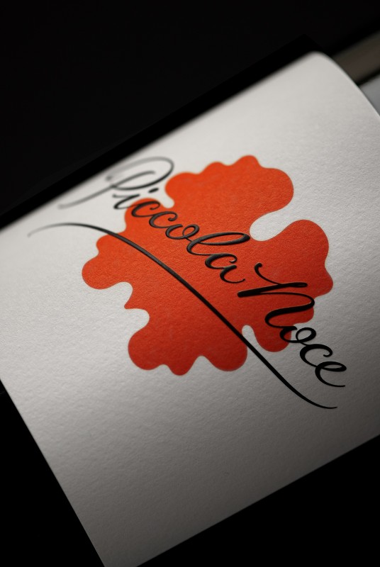
The brand was called Piccola Noce, Italian for “little nut”—a nod to their winery name, Vinoce —a portmanteau meaning “wine nut”.

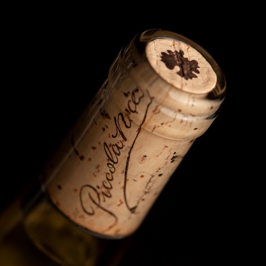
CF Napa developed an iconic solution and drew a stylized walnut as the main graphic of the label. The script was inspired by the Vinoce wordmark, but with additional flourishes and flairs to capture the brand’s laid-back, modern Italian bistro vibe. The contrast of the toothy white paper and the brightly colored graphics gave the front label a clean, pop-art feel; keeping with the artistic, boutique sensibility that Vinoce Vineyards is known for.

