Search
VR
Mexico’s Viñedos de La Reina came to CF Napa to refresh their VR brand. As the higher-end brand in their portfolio, the design needed to look more premium while continuing to use a VR monogram and crown lock up – a nod to their company name which translates to “vineyards of the queen.”
Client
Viñedos de La Reina
Country
Mexico
Project Scope
Logo
Packaging
Awards
2023 Packaging of the World
2023 World Brand Design
CF Napa gave the icon the royal treatment by refining the letterforms into a stronger, more contemporary monogram stamped in luxurious gold foil. The label shape was modernized by moving away from the triangle die cut to a classic straight-sided, larger label.

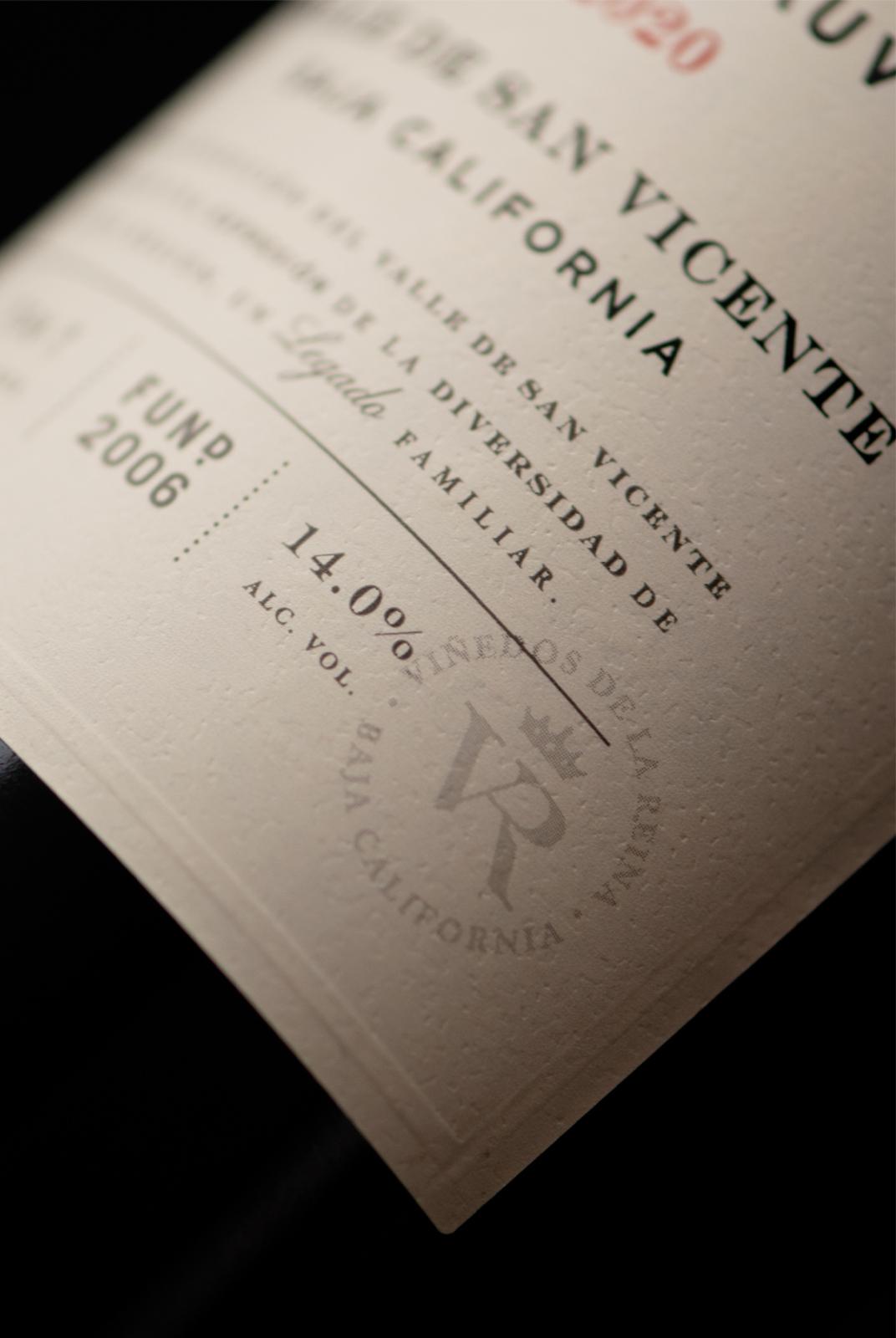
A toothy, cream-colored paper gave the design a warmer, more approachable feel. The embossed border detail, beautiful typography, and watermark seal better communicated the quality and pedigree of this well-established brand.
