Kenwood Vineyards Rugged Elements

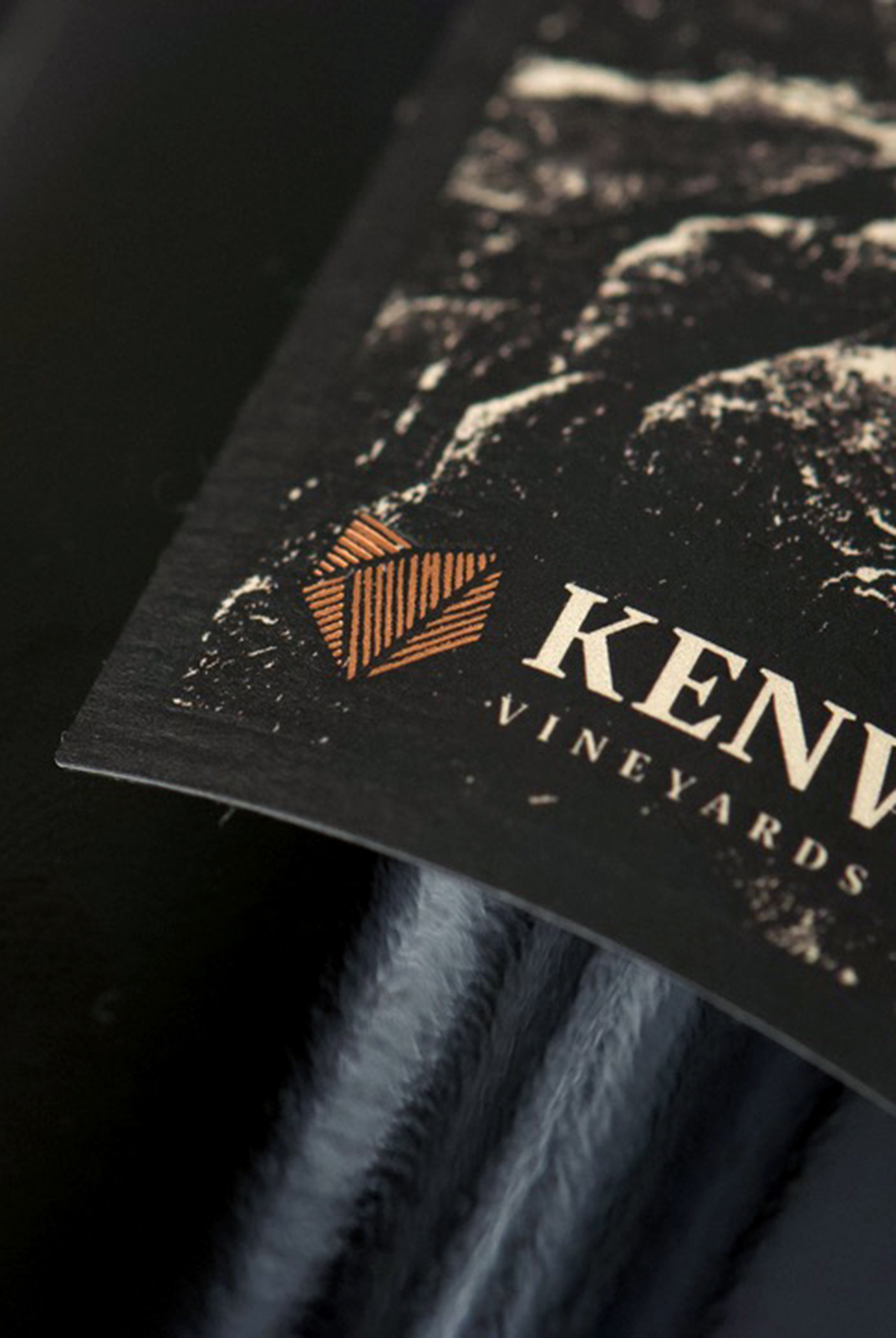
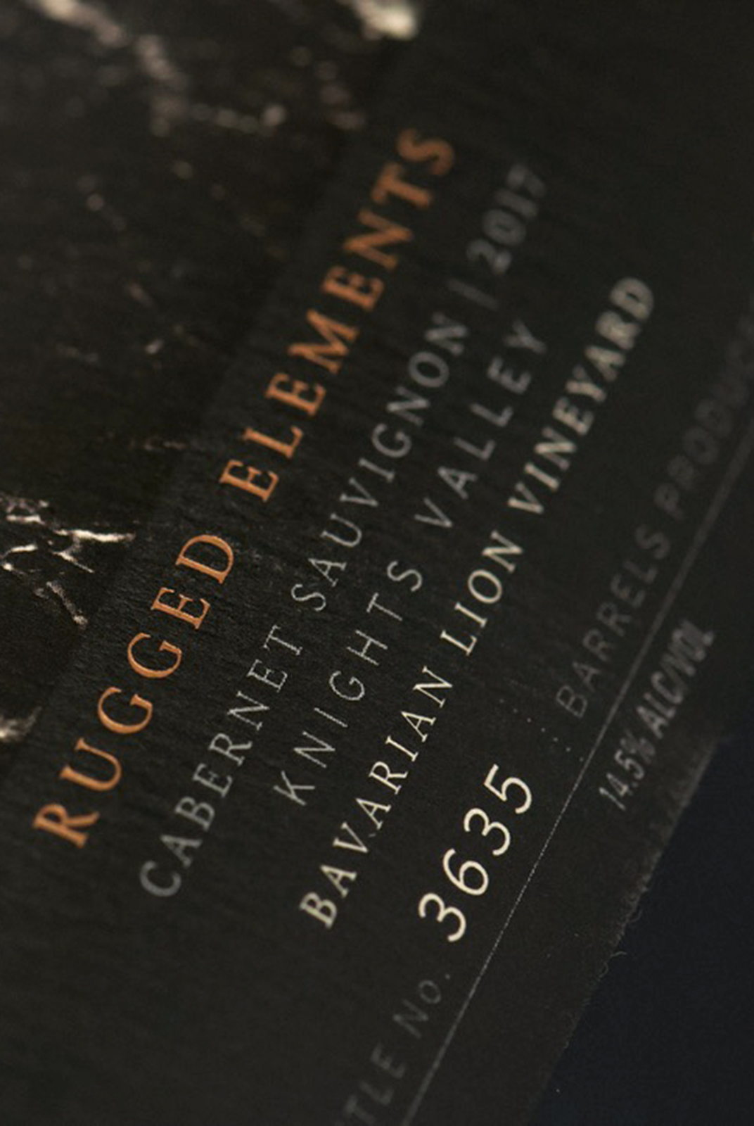
Pernod Ricard came to CF Napa to redesign the single vineyard tier for Kenwood Vineyards inspired by its new name - Rugged Elements - and each of the vineyard’s unique elements.
Client
Pernod Ricard
Country
United States
Project Scope
Logo
Packaging
Awards
2020 GDUSA - American Graphic Design Awards
2021 GDUSA - American Package Design Awards
2021 Packaging of the World
2021 Packaging of the World - Packaging You Shouldn't Miss in April 2021
2021 Packaging of the World - Top Packaging Projects of 2021
2021 San Francisco International Wine Competition - Silver
2021 World Brand Design
2022 Graphis Design Annual - Silver


While their current design looked premium, it shared a look too similar with their lower tiers and it was extremely difficult to tell the various wines from one another, causing confusion for tasting room staff and consumers.
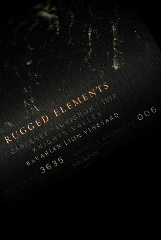
The new line of wines is completely unique from the other Kenwood Vineyards tiers while stylized photos provide easy differentiation between the SKUs. Each label utilizes a bold, black-and-white photograph of a natural element that is unique to each of the vineyards.


