Search
Lail Vineyards J. Daniel Cuvée

Lail Vineyards came to CF Napa to refresh the packaging for their flagship wine – J. Daniel Cuvée.
Client
Lail Vineyards
Country
United States
Project Scope
Logo
Packaging
Marketing
Digital
Named after Founder Robin Lail’s father and legendary vintner John Daniel, the design for this prestigious wine needed to reflect its exceptional quality and critical acclaim.
The principal focus of the redesign was to maintain the integrity of the equity elements while elevating the label’s sense of luxury. We reduced the size of the iconic bird illustration and repositioned the label copy to create more space, evoking a sense of sophistication. We showcased the upscale, exclusive nature of the wine by debossing all the type, giving the label a letterpressed feel, like a fine invitation. A toothy paper was selected and the illustration was structurally embossed, both of which provided more textural elements to promote the wine’s elevated positioning.

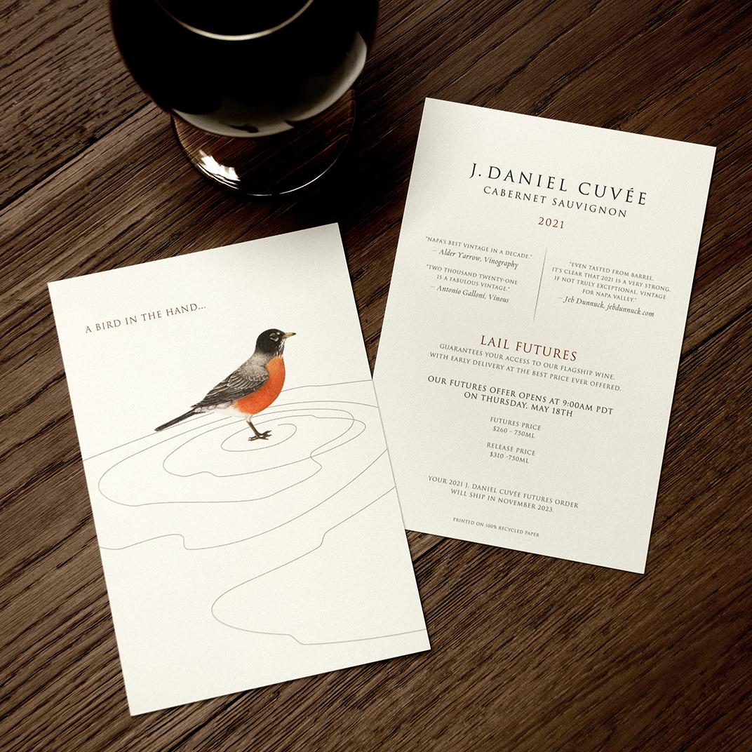
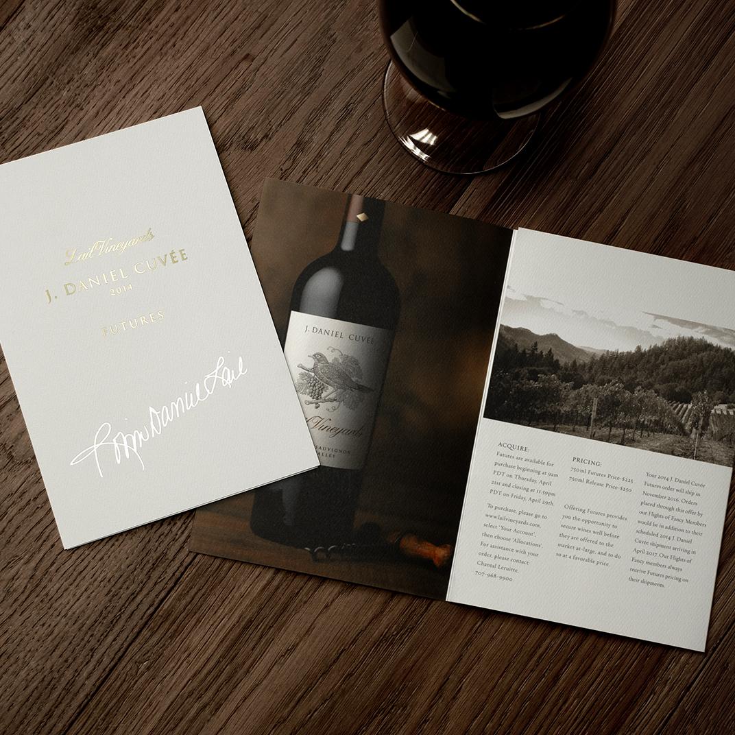
For the 2022 J. Daniel Cuvée Futures mailer, CF Napa’s clever portrayal of time running out comes to life in a custom illustration, combining a wine glass and an hourglass to create a visual representation of the limited time offer. The wine glass silhouette is filled with sand created through gold foil and an embossed texture that gives movement and dimension. The back of the mailer displays the iconic Lail Vineyards robin illustration along with the information for procuring the wine. The Fulton J. Shen quote, “Patience is power,” provides a final call to action, enticing the reader to take advantage of the offering and reward their future self with a guaranteed, specially priced allotment of the brand’s flagship wine.