Search
Groth

A pioneer in the Napa Valley for 40 years, the Groth family helped Oakville gain fame as one of the world’s preeminent wine regions.
Client
Groth Vineyards & Winery
Country
United States
Project Scope
Brand Strategy
Brand Portfolio Architecture
Story Development
Logo
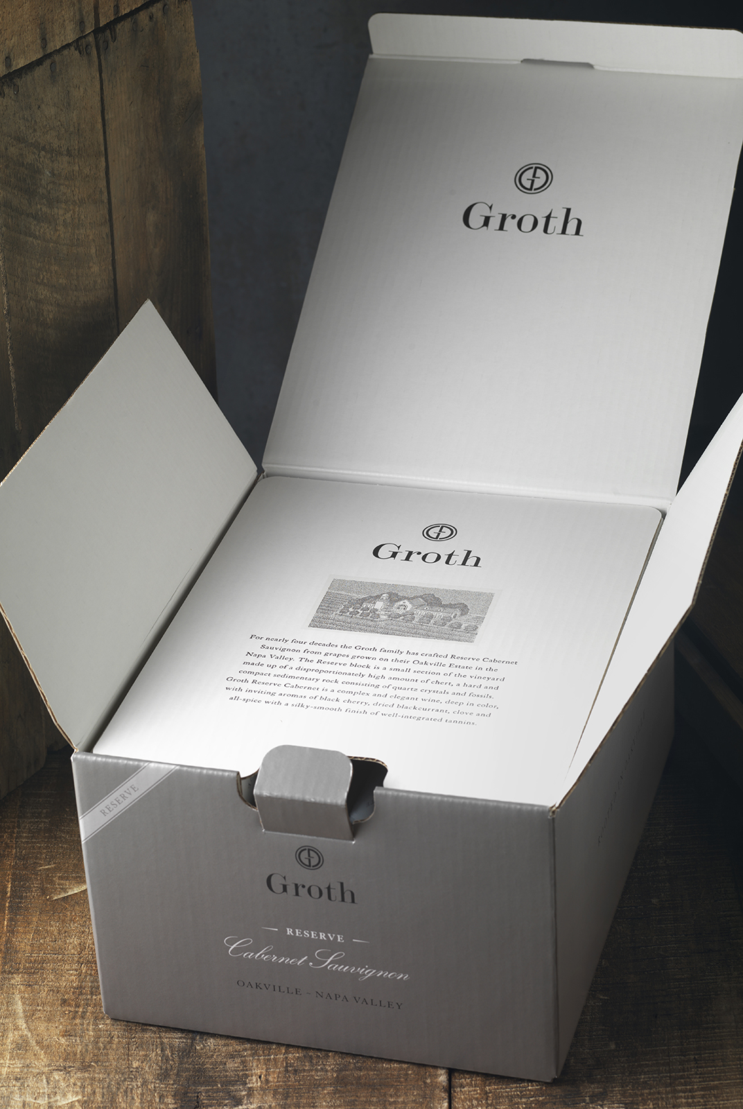
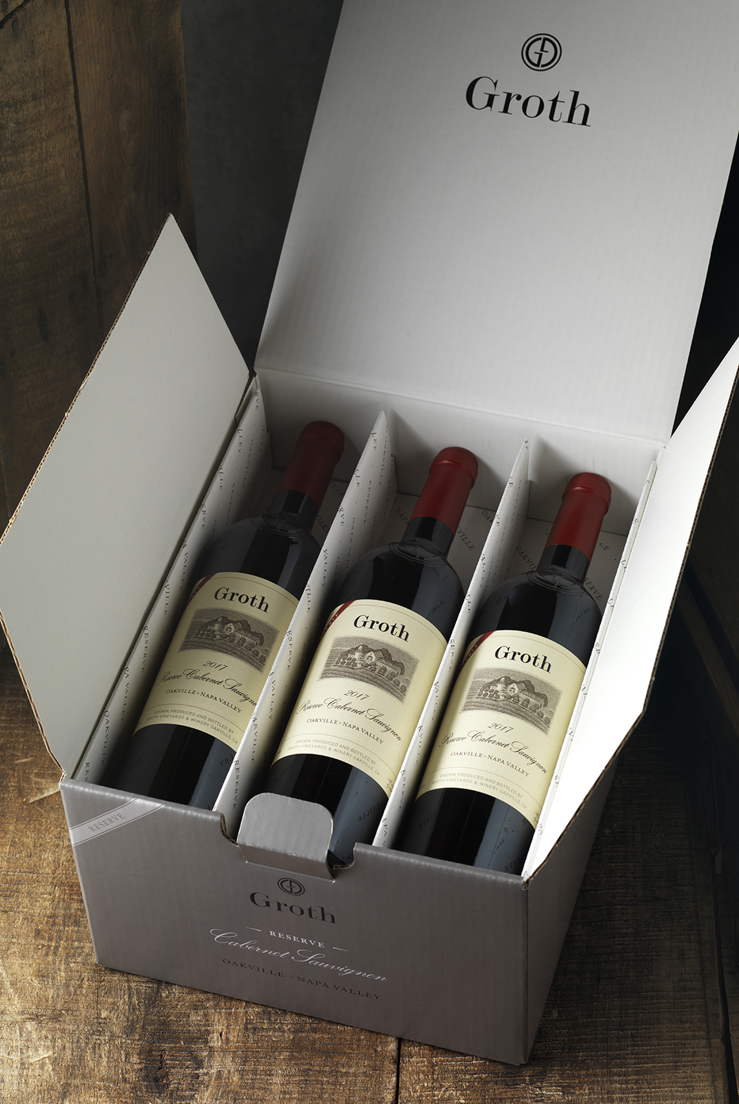
Packaging
Marketing
Digital
Visit
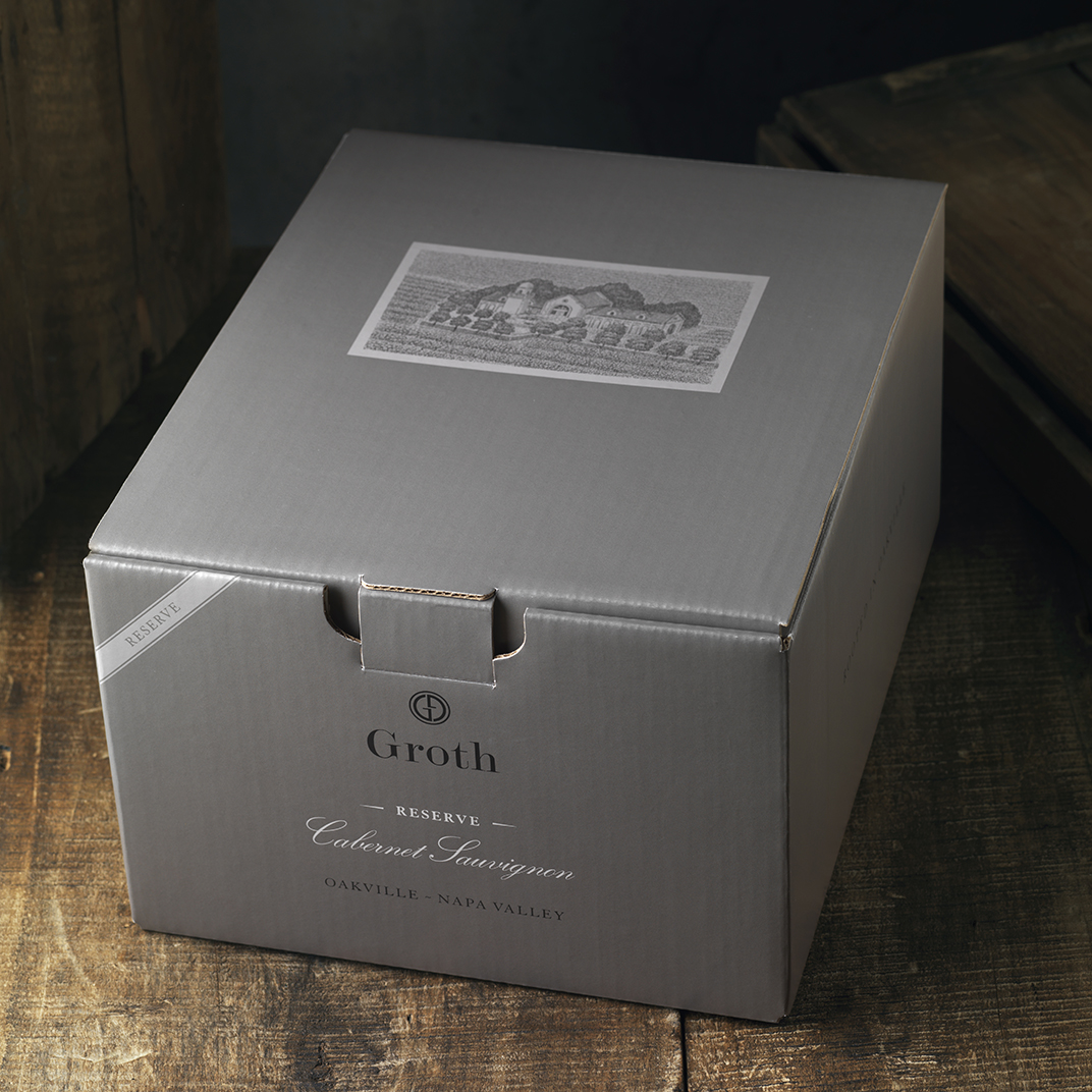
The family tasked CF Napa with refining their brand strategy, logo, and packaging for the future without losing touch with its brand equities. Oakcross prominently featured their winery illustration of the Groth mission among its famed vineyards in a bold new label design emblazoned with the reimagined gold-foiled GG icon.
The Estate White Wine was a classic interpretation of Groth’s well-known package design, complete with their pen and ink illustration of the winery and linen-textured paper. The adherence to a more familiar label structure acted as a reminder of the winery’s history of prominence in Oakville. The limited copy and blind emboss of the icon gave the bottle a more premium feel.
The Neighbors Series honored Groth’s grower partners and fellow advocates for the Oakville region through a classic yet sleek new label with a blind embossed GG icon; creating a bold statement both visually and texturally.


For the gift catalog, large, vibrant photos were utilized to give the catalog a modern upgrade. New photography, with creative direction by CF Napa, shows off the iconic wine in abundant table spreads
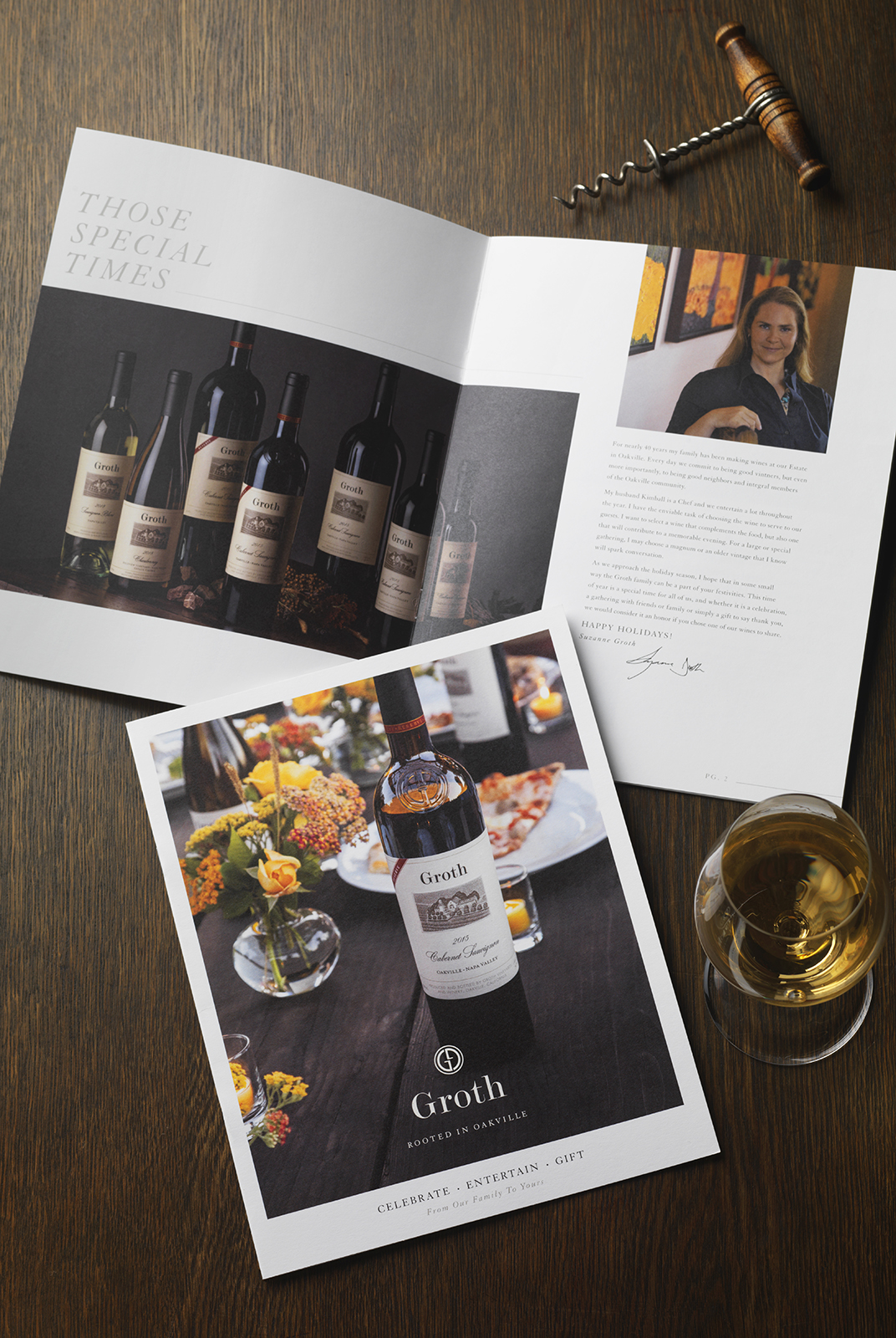
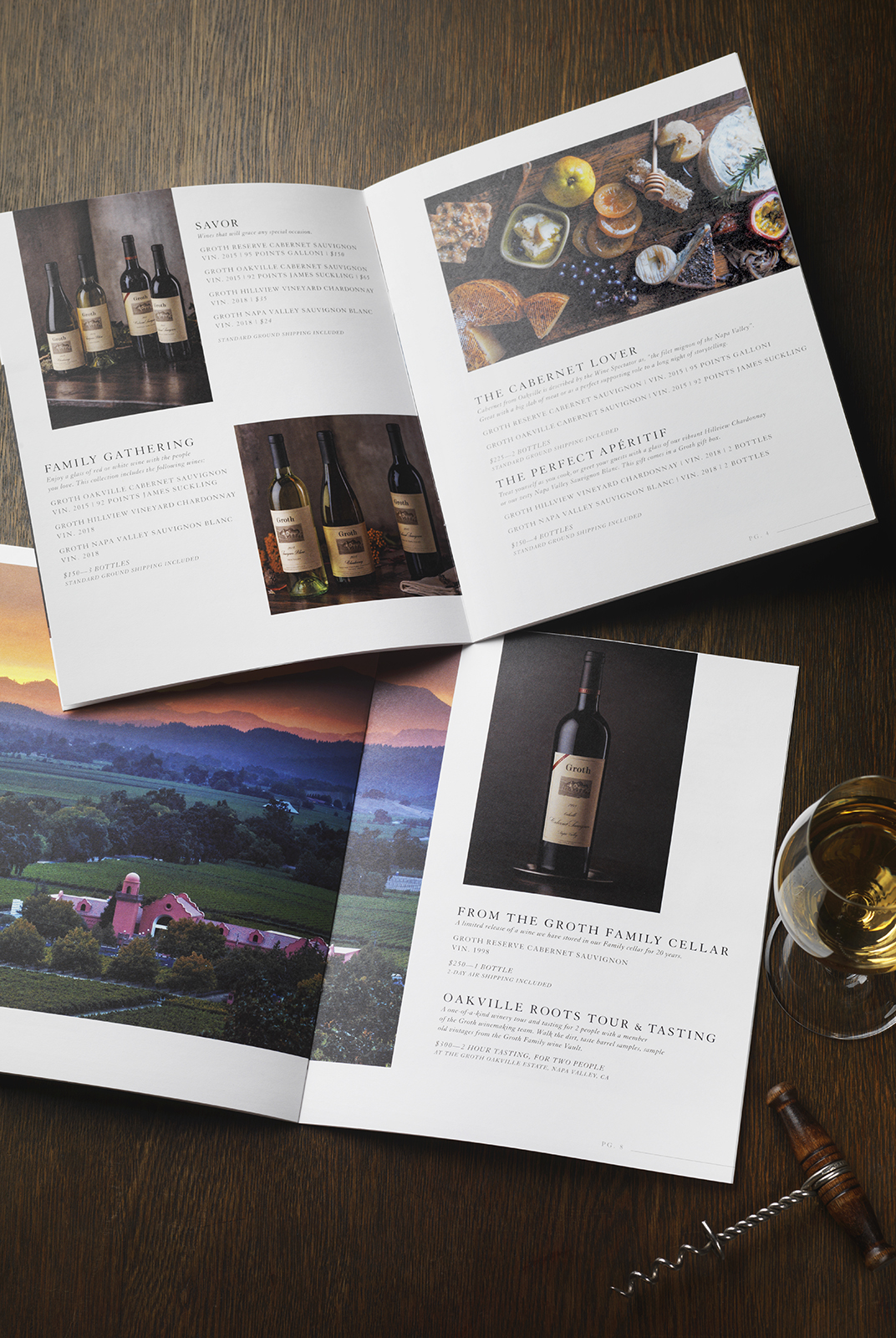
The copy draws on the new brand story to call out the perfect gift for each person on your list.
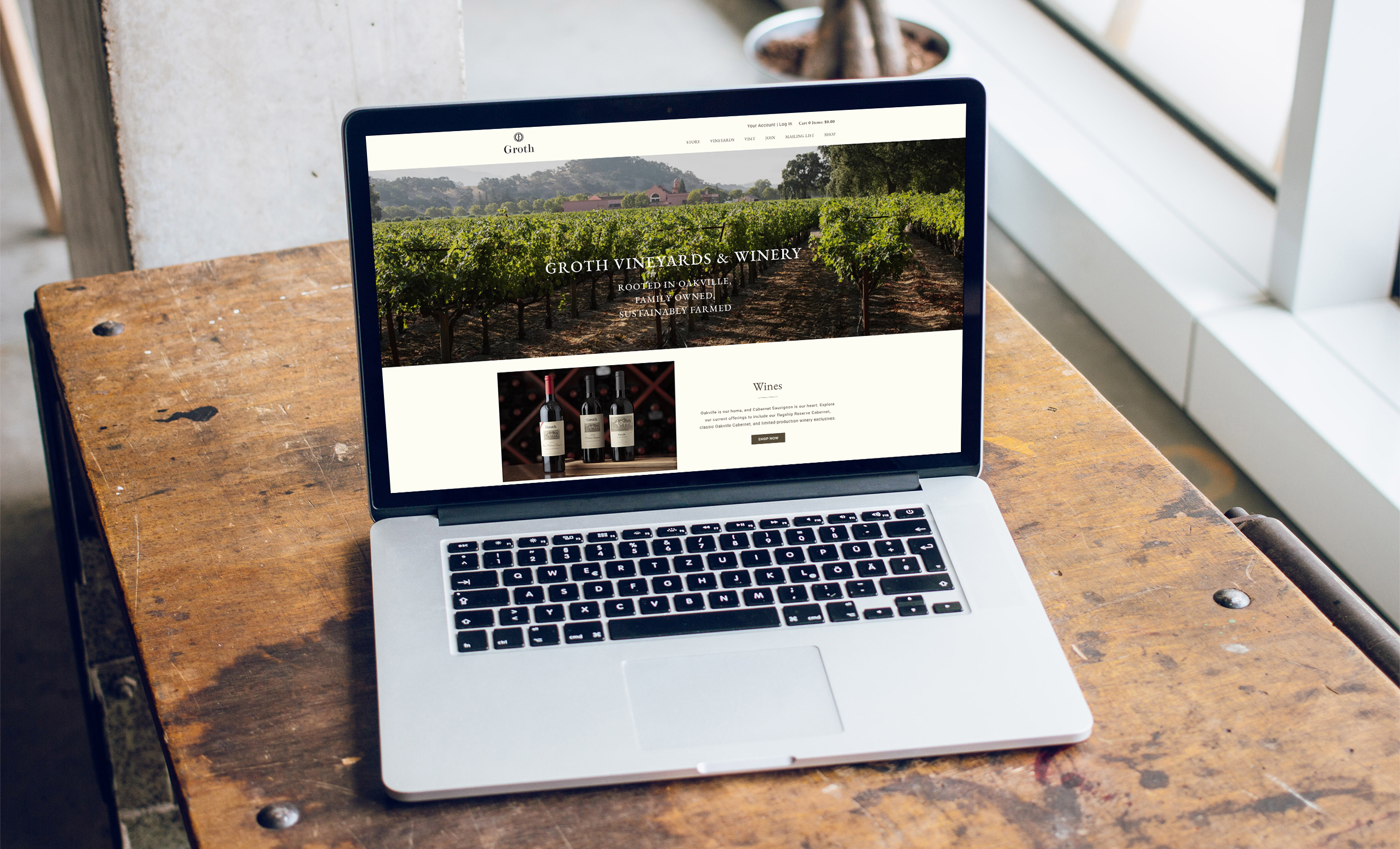
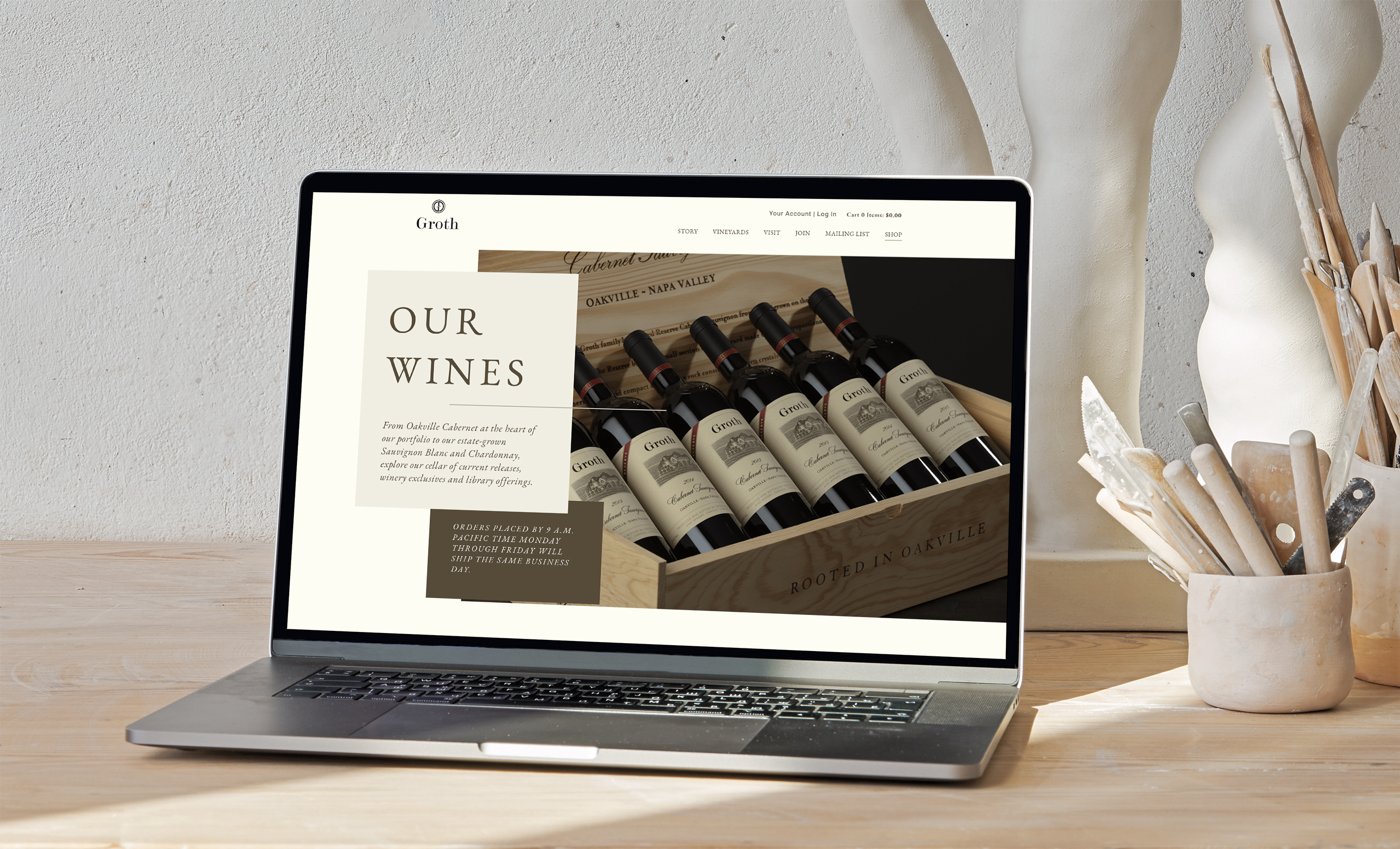
When Groth came to CF Napa to revamp their website, their main goal was to better align their brand promise and improve their ecommerce functionality. They wanted to improve their client's shopping experience and increase DTC sales, allowing them to purchase bottles of their critically acclaimed wines or sign up for one of their wine clubs from the comfort of their own homes.