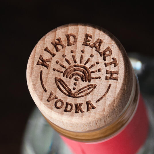
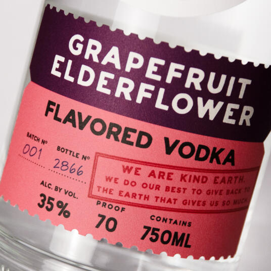
Kind Earth

Kind Earth is a new Organic Vodka brand devoted to crafting inventive, flavored vodkas that elevate the everyday cocktail.
Client
Kind Spirits
Country
United States
Project Scope
Brand Strategy
Story Development
Logo
Packaging
Custom Bottle
Awards
2025 GDUSA Graphic Design Awards
2025 Harpers Design Awards - Silver
2025 Packaging of the World
2025 Packaging of the World - Packaging You Shouldn’t Miss
2025 The Tasting Alliance Design Competition - Gold
2025 The Spirits Business Design and Packaging Masters - Silver
2025 World Brand Design Society

The brand needed to stand out in a crowded marketplace while showcasing its strengths: quality, organic ingredients, nothing artificial, fresh taste, and a commitment to Planet Earth.
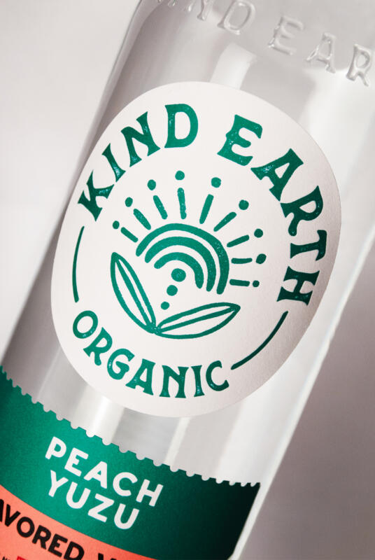
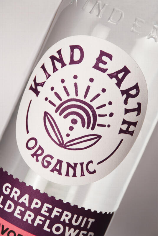
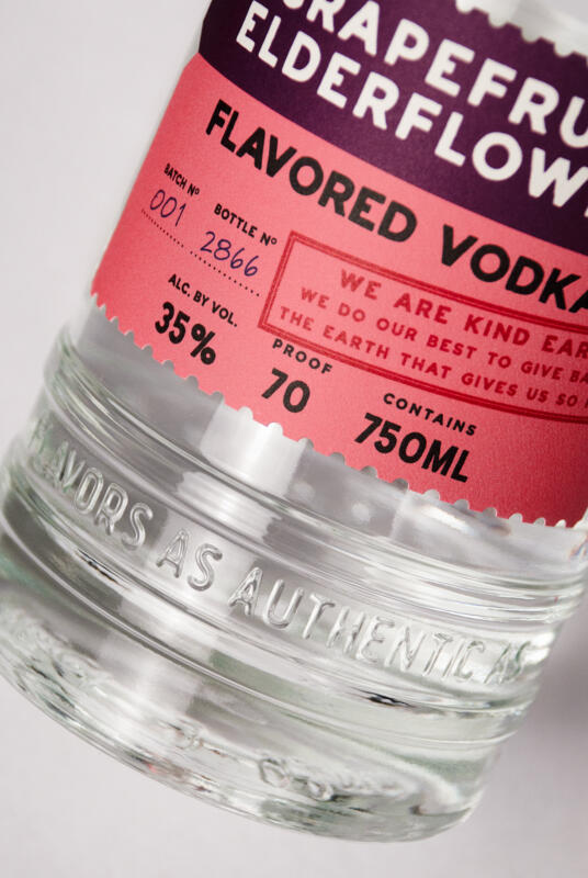
Our solution—a fresh and friendly design that communicates the brand’s personality and key messaging through color, style, and a custom bottle. The label design utilizes bright colors to clearly differentiate the flavor-driven spirits and express the natural fruit essences in each vodka. A two-piece label system makes product extension easy. The main branding takes center stage with a custom icon and wordmark executed in a woodblock printing style. The minimalist interpretation of the sun and Earth’s natural gifts come together in a memorable icon with a feel-good 70s vibe.
