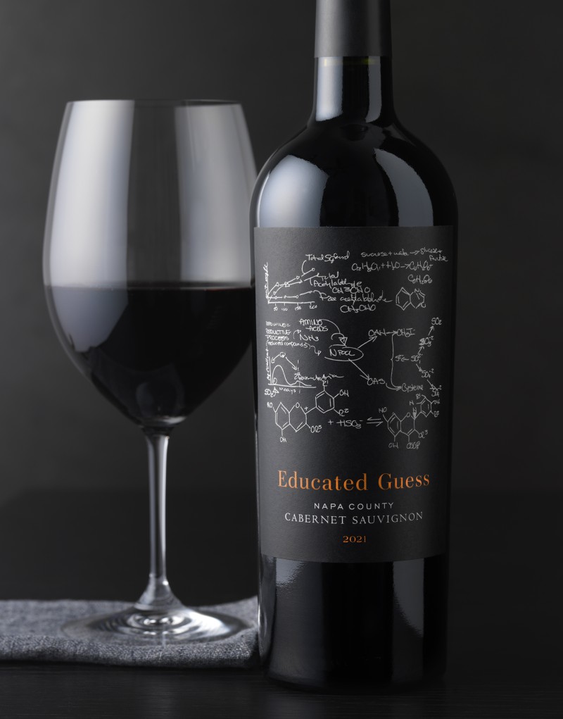
Educated Guess

Roots Run Deep came to CF Napa to redesign their Educated Guess brand.
Client
Roots Run Deep
Country
United States
Project Scope
Logo
Packaging
Awards
2024 Packaging of the World
2024 World Brand Design

The current packaging was causing confusion in the marketplace with their other brand, eg by Educated Guess. There needed to be greater differentiation between the two brands and the price point perception needed to be elevated to match the quality of the wines and their sourcing.

The brand name, appellation, varietal, and vintage were placed in the center of the label. The iconic wine formulas were simplified and pulled away from the wordmark, creating a more premium perception that was representative of the quality of the wine. The color coding was continued through the redesign to allow loyal consumers to identify their favorite wines.
