Robert’s Vodka

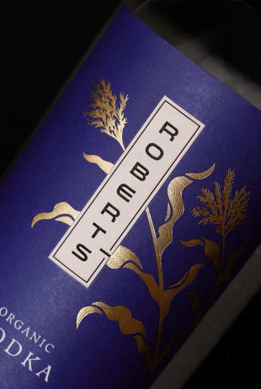
Following the creation of the distillery branding for Oak House Distillery and their Robert’s line of Gins, they returned to CF Napa to develop the packaging design for their Robert’s Organic Vodka.
Client
Oak House Distillery
Country
United States
Project Scope
Logo
Packaging
In-House Illustration
Awards
2024 GDUSA American Graphic Design Awards
2024 World Brand Design Society
2024 Packaging of the World
2025 BevTest Packaging Compendium - Best Spirits Label
2025 CQ 79 - Runner Up
Show More


The design needed to echo the Asian influence of the Gin packaging while highlighting the features of the Vodka.
CF Napa drew a corn stalk to represent the organically produced American corn that forms the foundation of the Vodka. The drawing was gilded in gold foil and popped against the rich plum hue of the label. For a subtle textural detail, dainty lines in the corn illustration were micro-embossed. The Robert’s wordmark was transcribed vertically in a contemporary font, hinting at the inspiration the brand takes from Asian design.
CF Napa drew a corn stalk to represent the organically produced American corn that forms the foundation of the Vodka. The drawing was gilded in gold foil and popped against the rich plum hue of the label. For a subtle textural detail, dainty lines in the corn illustration were micro-embossed. The Robert’s wordmark was transcribed vertically in a contemporary font, hinting at the inspiration the brand takes from Asian design.
