Search
Lo Duca
Lo Duca Bros. is a Wisconsin-based importer and distributor of fine Italian wines from small, family-owned vineyards.
Client
Lo Duca Wine & Spirits
Country
United States
Project Scope
Logo
Packaging
Awards
2025 Packaging of the World
2025 World Brand Design Society
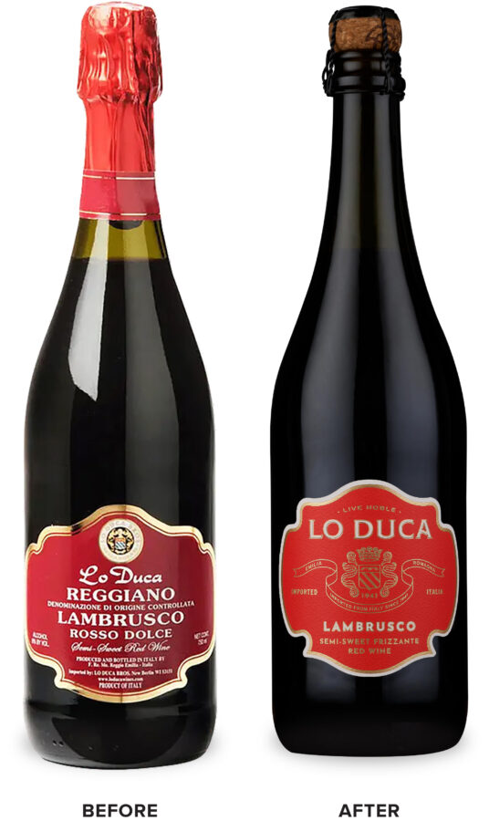
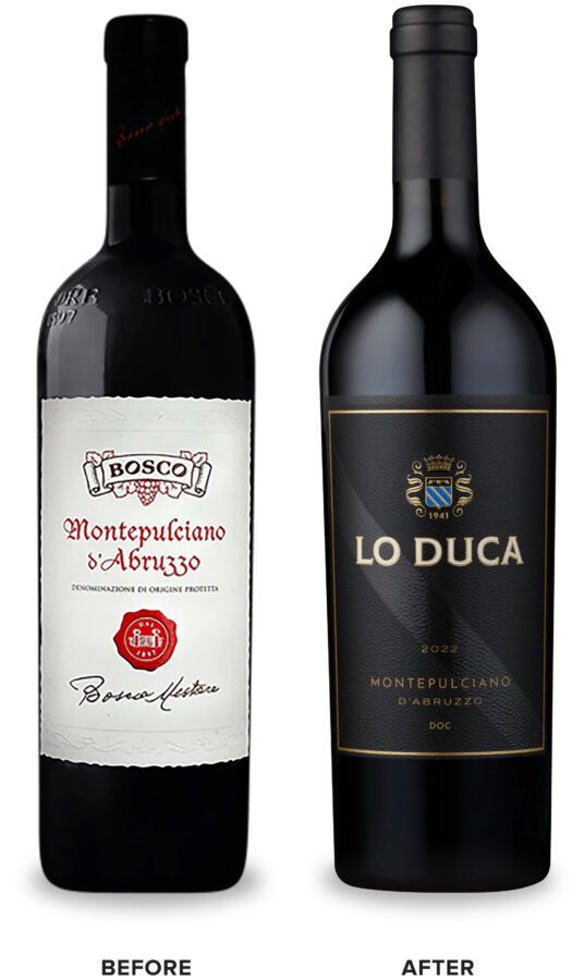
Many of the wines in their portfolio are unfamiliar to mainstream consumers, creating a strong opportunity for education. For the packaging redesign, Lo Duca aimed to spread awareness of these lesser-known varietals, engage younger consumers that are excited to try new wines, and upscale the packaging for their classic Italian varietals. We organized these offerings into 2 tiers – a frizzante tier and a still wines tier.
The frizzante wines tier is comprised of their lesser-known varietals and takes on a more youthful look. A vibrant color was selected for each varietal bringing a New World aesthetic to the packaging that will help consumers easily identify the wines. Detailed tasting notes help educate the consumer.
The frizzante wines tier is comprised of their lesser-known varietals and takes on a more youthful look. A vibrant color was selected for each varietal bringing a New World aesthetic to the packaging that will help consumers easily identify the wines. Detailed tasting notes help educate the consumer.
The still wines tier is a collection of Lo Duca’s more traditional Italian varietals that take on a more premium aesthetic. A sophisticated black label is bisected by a traditional diagonal stripe detail enhanced with a spot gloss finish.
We reimagined the original Lo Duca Bros. crest into a modern icon, including imagery of a duke’s crown as a call back to the Italian translation of the brand name – “the duke”.