Heitz Cellar

Heitz Cellar, the winery legend that helped shape the history of Napa Valley winemaking came to CF Napa to re-envision their brand for the future.
Client
Heitz Cellar
Country
United States
Project Scope
Logo
Packaging
Marketing


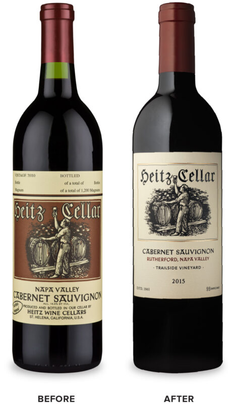
Following the acquisition of Heitz Cellar by the Lawrence family, the desire was to bring a respectful touch of modernization and elevated quality cues while remaining respectful of the iconic wine brand’s legacy and extremely recognizable packaging.
CF Napa’s solution was to first identify the brand’s long-standing equity elements and then respectfully and intelligently refresh them.
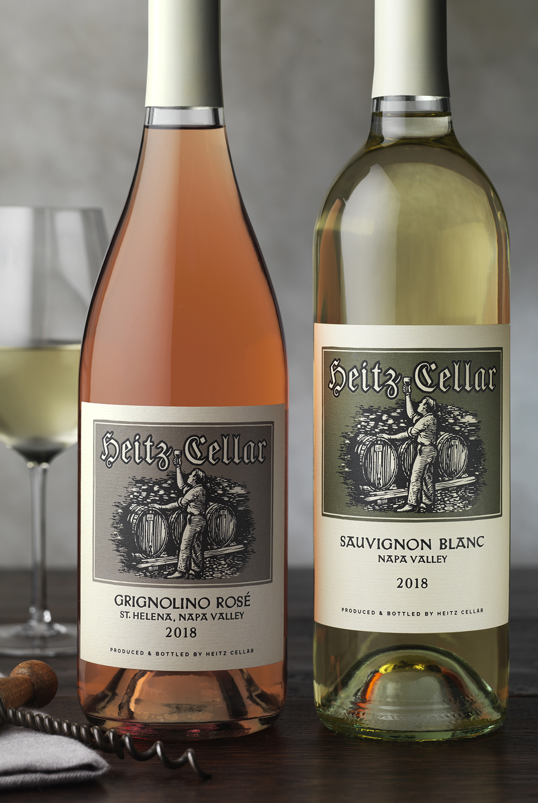
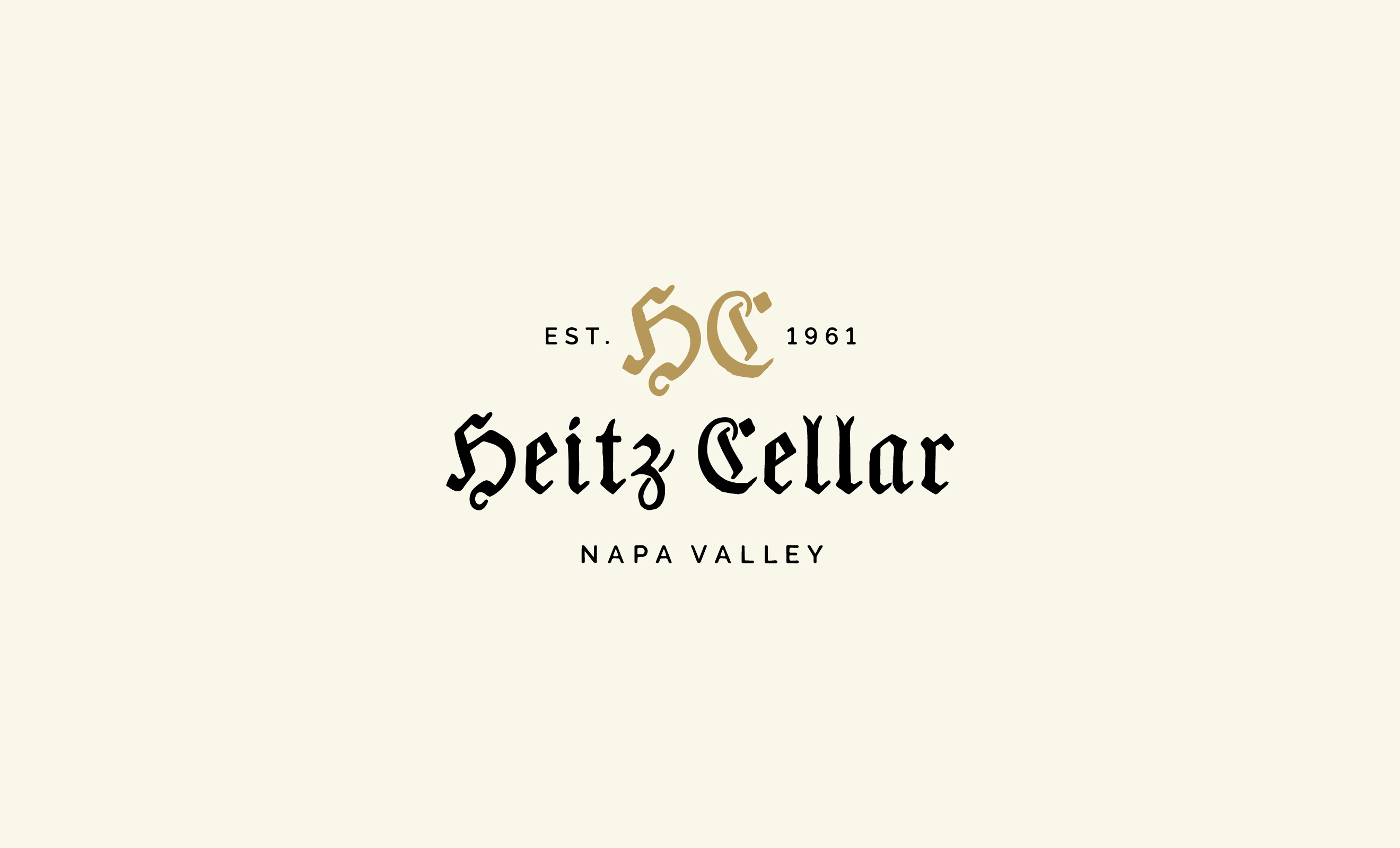
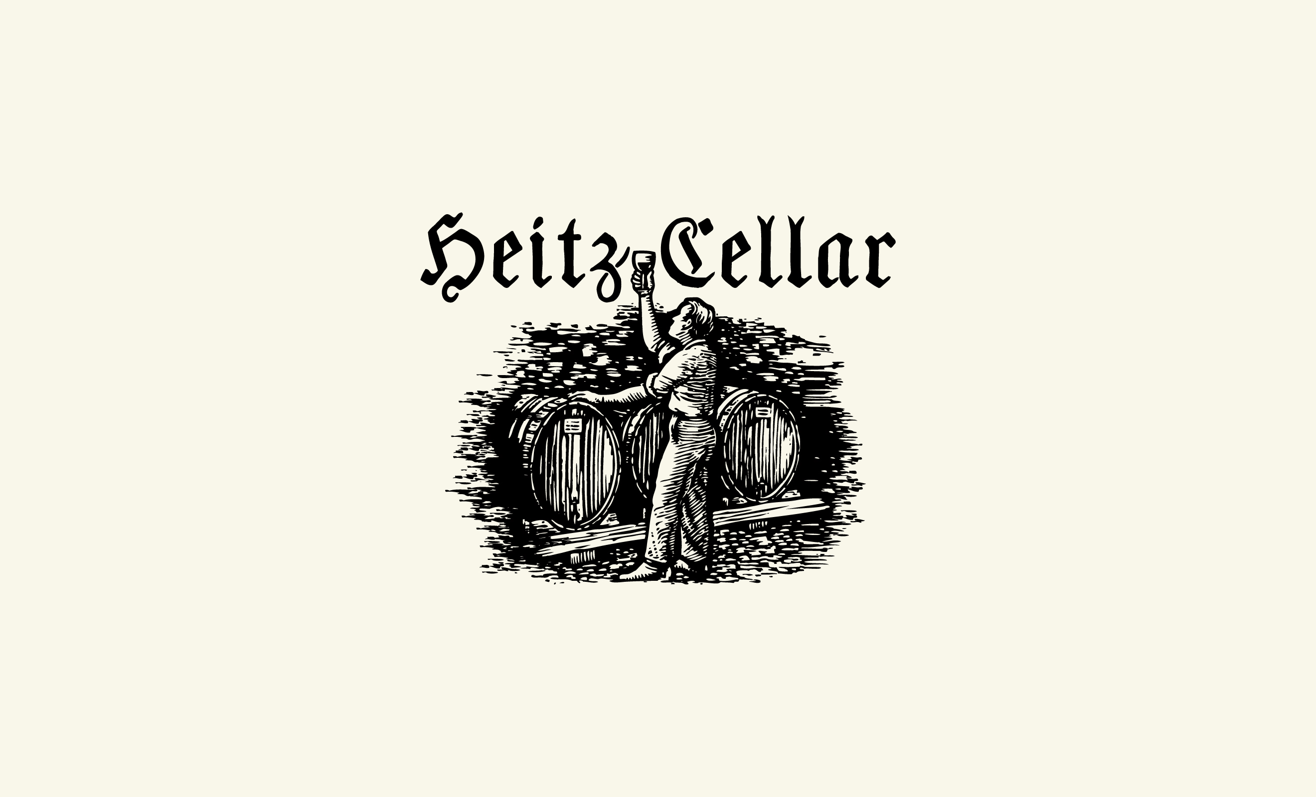
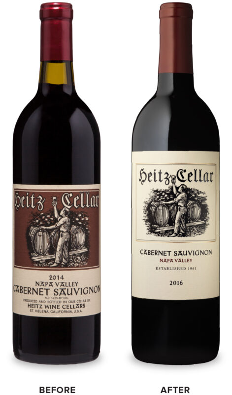
The historic wordmark was made more readable by balancing some of the letterforms, the quirky typeface used for the varietal information was crafted to be more readable and the label’s information was simplified to provide a cleaner, more elegant presentation. The new tiered system allowed for specialty designations such as vineyard designates and bottle numbering for higher tiers while maintaining a sophisticated look. CF Napa built off the new system to create bespoke secondary packaging for the brand to enhance the consumer’s brand experience.
The historic wordmark was made more readable by balancing some of the letterforms, the quirky typeface used for the varietal information was crafted to be more readable and the label’s information was simplified to provide a cleaner, more elegant presentation. The new tiered system allowed for specialty designations such as vineyard designates and bottle numbering for higher tiers while maintaining a sophisticated look. CF Napa built off the new system to create bespoke secondary packaging for the brand to enhance the consumer’s brand experience.
