Search
Flora Springs Single Vineyard Cabernets
Flora Springs came to CF Napa to redesign the packaging for their small-production Single Vineyard Cabernets.
Client
Flora Springs
Country
United States
Project Scope
Brand Portfolio Architecture
Logo
Packaging
Awards
2025 Packaging of the World
Each of the wines have a proprietary name that reflects the aspect of Mother Nature that makes each individual vineyard unique. The new packaging system needed to be flexible enough to allow each wine to reflect its own personality and story while still feeling part of a cohesive family.
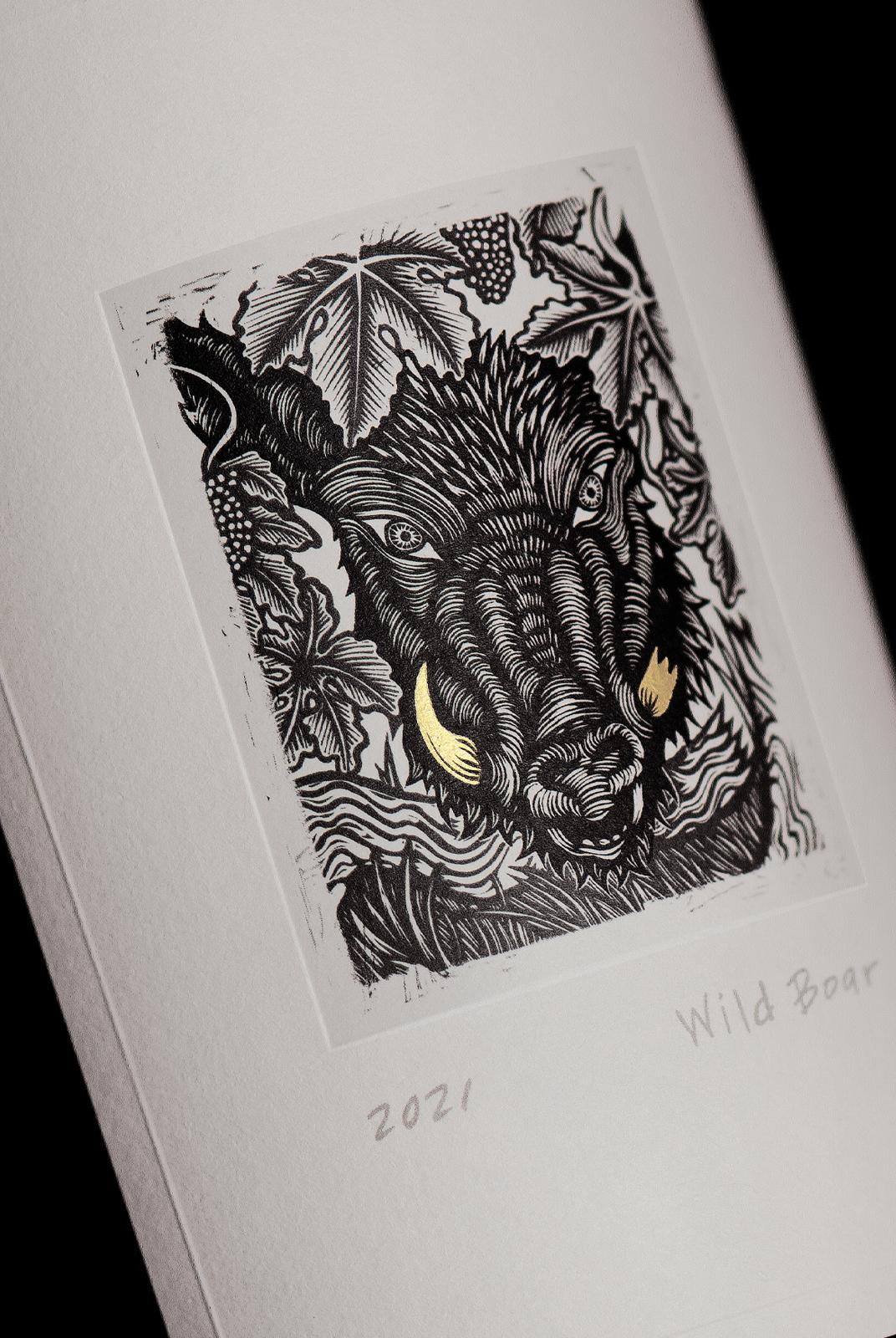
Detailed woodcut style illustrations were commissioned for each of the wines:
Holy Smoke: A representation of the lingering fog in the valley that contributes to an ideal climate.
Out of Sight: Honoring the birds of prey that quietly work to maintain a balanced ecosystem in the vineyards.
Wild Boar: The unexpected guest of the vineyards with which workers learn to coexist.
CF Napa incorporated the illustrations into labels, displaying them as fine art pieces set within alternating chiseled edge debossed and embossed frames. The vintage and proprietary names were handwritten and placed under the illustrations, accentuating the limited edition, fine art feel. Details on each of the drawings were highlighted in gold foil, giving a special touch to these unique Cabernets.