Davis Estates

Client
Davis Estates
Country
United States
Project Scope
Logo
Packaging
In-House Illustration


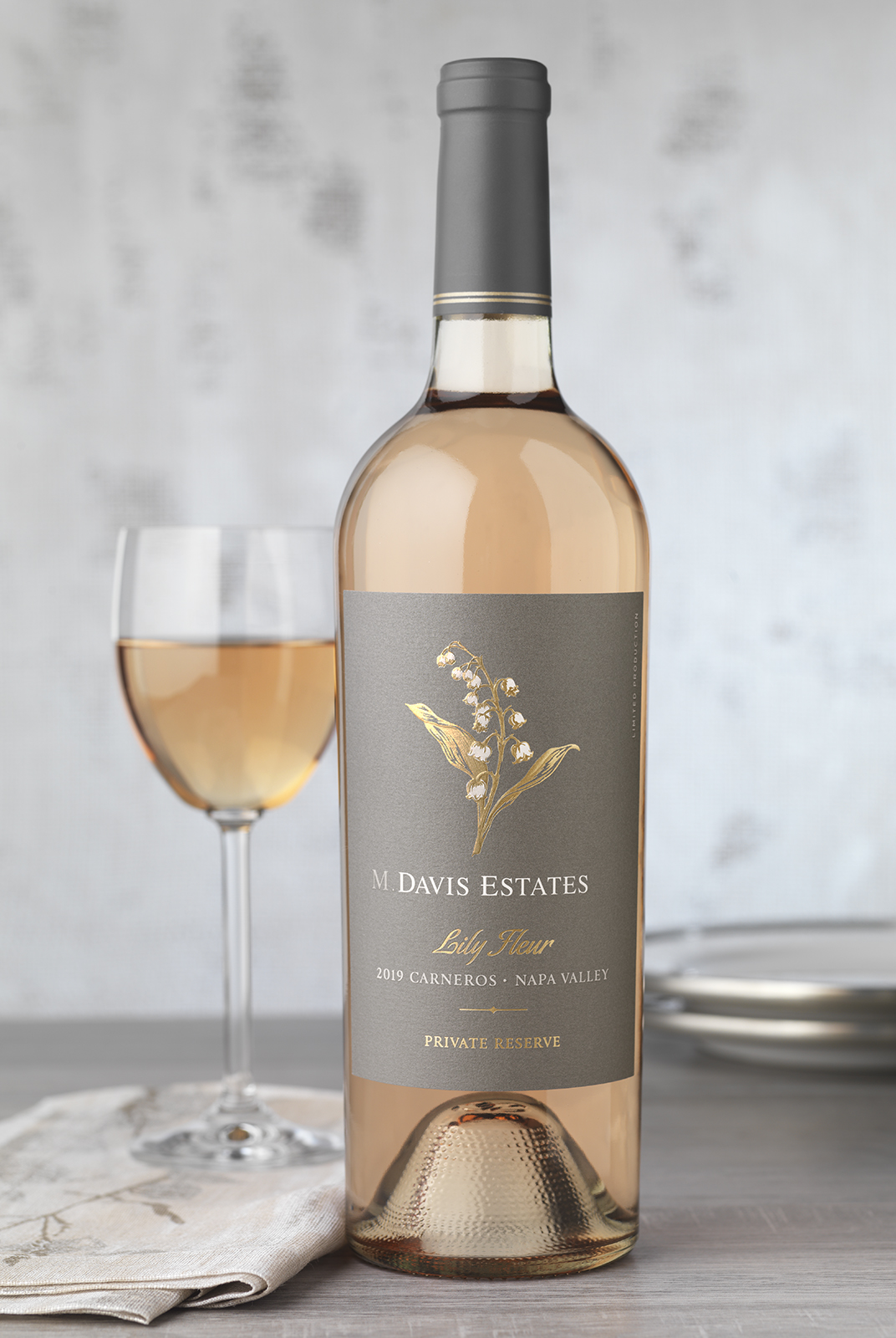
A pewter neck wrap and double-embossed details give Davis Estates’ top-tier Phase V wine a high-end look.

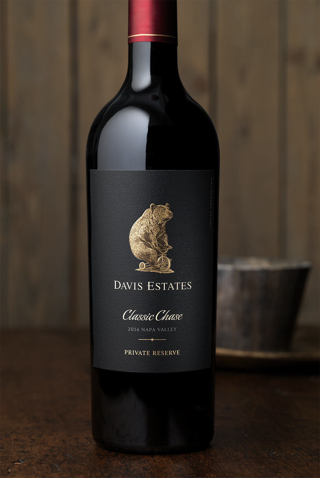


As a specialty wine, Lily Fleur needed to feel like it was part of the Davis Estates family while standing apart as a unique offering. CF Napa built upon the label structure they had previously established for the winery, allowing the new wine to look cohesive with the rest of the family. A hand-drawn illustration of a Lily of the Valley flower became the main graphic of the label. The gold foil leaves and stem bloom with pearlized foil flowers. The light-catching foils and the wine’s beautiful shade of pink pop against a soft gray label and capsule.
