Cliff Lede

Driven by a passion for creating exceptional wines, construction magnate Cliff Lede searched for a plot of land in Napa Valley that he could transform into a winery.
Client
Cliff Lede Vineyards
Country
United States
Project Scope
Packaging

His dreams were realized in 2002 when he acquired the 60 acres in the renowned Stags Leap District that would become Cliff Lede Vineyards. At Cliff Lede Vineyards, wine tasting is a completely immersive experience blending wines from Napa Valley’s diverse terroir, music, and art. From the Backstage Tasting Lounge featuring art by well-known rockstars to the vineyard blocks, lovingly referred to as “Rock Blocks”, named after Cliff’s favorite songs and albums, music is an ever-present influence at the winery.

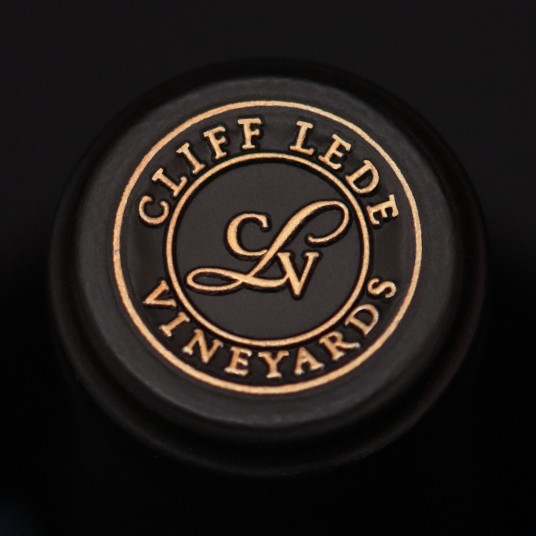
For their top-tier wines, aptly named “Platinum” to continue the musical influence, Cliff Lede Vineyards sought to elevate the packaging for these wines be more premium and better reflect the prestige of their Stags Leap District AVA. In addition, some consumers found the handwritten script on their labels difficult to read, and the hierarchy inconsistent, preventing the labels from being easily discernable from one another. Our solution is a clean, modern design system utilizing two-labels with the Cliff Lede wordmark positioned prominently at the top of the label hierarchy. The secondary strip label conveys all wine-specific information including the varietal and the names of the distinguished vineyards. An embossed border frames the wordmark and creates a billboard to draw attention to the branding and was echoed by an embossed frame around the secondary label. Gold foil details add a final premium touch to these exceptional wines.
For their new wine, "Rhythm", a dark black label paper contrasted against the lustrous gold foil to provide a luxurious sensibility for the premium Cabernet Sauvignon.
For their new wine, "Rhythm", a dark black label paper contrasted against the lustrous gold foil to provide a luxurious sensibility for the premium Cabernet Sauvignon.


