Search
Big Easy
Big Easy Spirits Co. came to CF Napa to create a new brand inspired by its New Orleans roots.
Client
Big Easy Spirits Co.
Country
United States
Project Scope
Logo
Packaging
Awards
2024 World Brand Design Society
2024/25 World Brand Design Society - Product Creation Design, Bronze
2025 Packaging of the World
2026 Graphis Design Awards - Gold
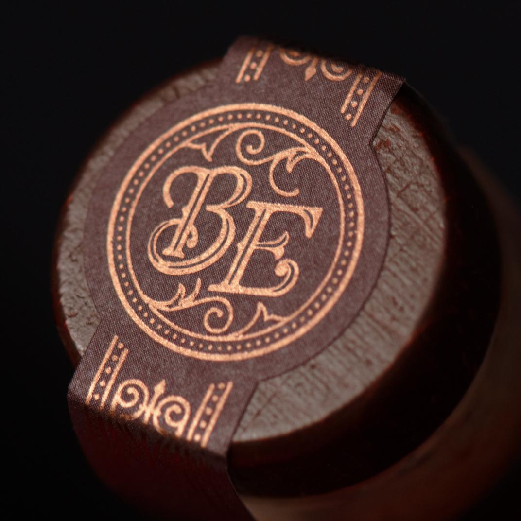
Inspired from an exceptional Old-Fashioned recipe, this whiskey is infused with a blend of herbs, spices, botanicals and fruit. The whiskey’s new packaging needed to reflect the cocktail culture and energy of New Orleans with a subtle, sophisticated approach.
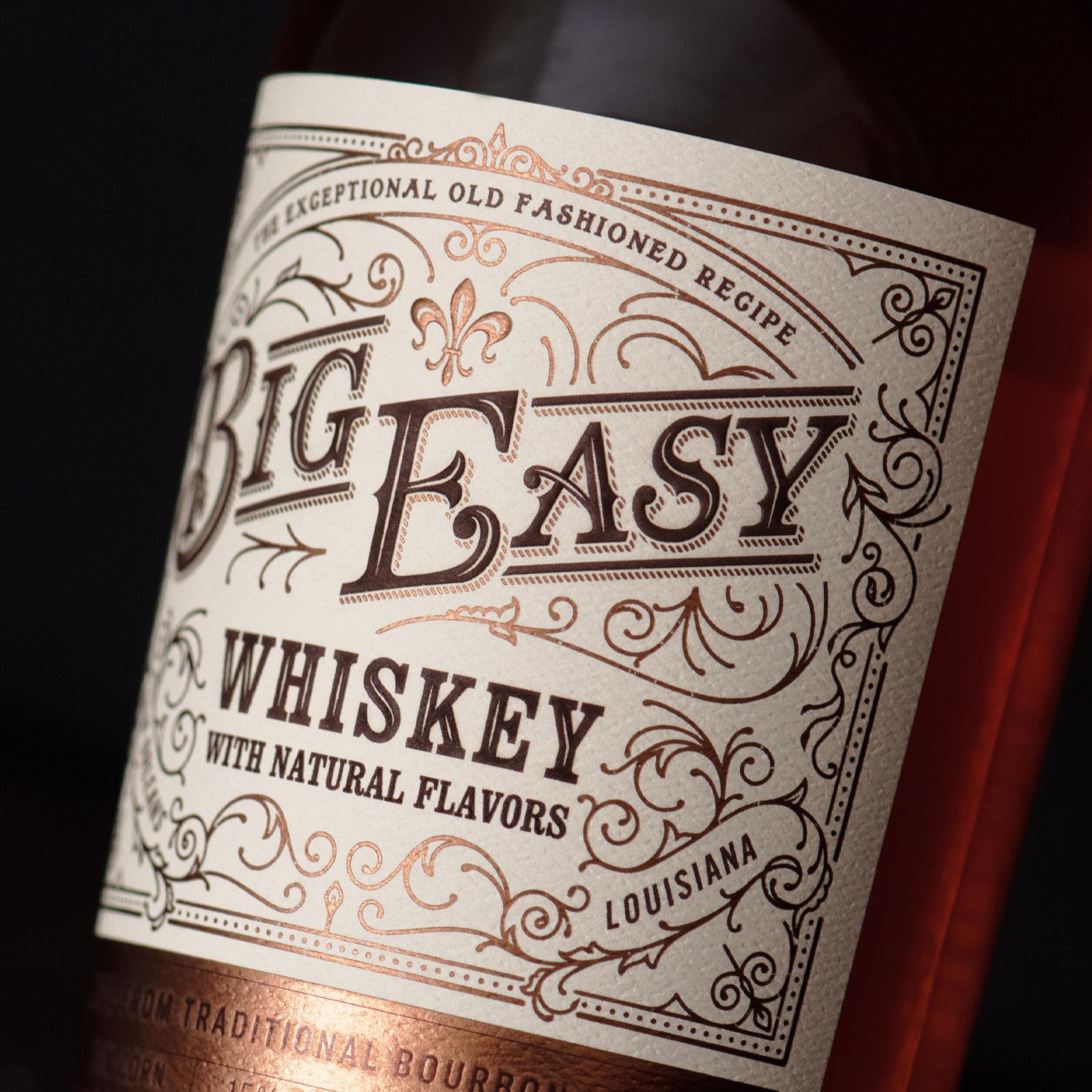
CF Napa drew the Big Easy wordmark in a custom nostalgic typeface with a bit of French flair. Filigree details encompass the mark and echo the wrought iron features of classic New Orleans architecture. A fleur-de-lis icon provides an additional nod to the French heritage of the region. Copper foil highlights the Bourbon mash bill of this exceptional cocktail-worthy spirit. The color palette of cream, plum, and copper pays homage to the vibrant colors and party atmosphere of Bourbon Street while establishing a timeless motif for the brand.