Search
Bear Moon Spirit

Bear Moon Spirit is a California-based brand that celebrates reflection and rebirth, with each sip offering a moment of stillness and a ritual of reconnecting to a sense of balance in a fast-paced world.
Client
Corning & Company
Country
United States
Project Scope
Logo
Packaging
Marketing
The brand name is based on the full moon in January, dubbed the bear moon by Native Americans for its alignment with the birth of black bear cubs.
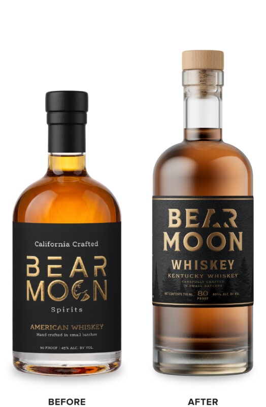
Corning & Company came to us to develop a more premium and compelling package that better captured the ethos of the brand name. The new design system needed to easily extend into multiple SKUs with clear differentiation between them. The wordmark with the bear was the primary equity element of the brand and was how consumers identified the brand on store shelves, so the new packaging design would need to retain, yet improve, this equity element.
Corning & Company came to us to develop a more premium and compelling package that better captured the ethos of the brand name. The new design system needed to easily extend into multiple SKUs with clear differentiation between them. The wordmark with the bear was the primary equity element of the brand and was how consumers identified the brand on store shelves, so the new packaging design would need to retain, yet improve, this equity element.

We reimagined the wordmark, drawing a bear silhouette that elegantly defines the counterspace within the letterforms of the modern, bold font. The label was redesigned utilizing deep rich colors and a horizon line of silhouetted trees, inferring a dark night scene that gives the brand a sense of place, provides visual interest, and embraces the brand’s Northern California roots. Color and large type for each spirit name provided a clear system for SKU differentiation while gold foil details put the final premium touch on the revitalized brand.