Feather & Folly

Goose Ridge Estate Vineyard & Winery came to CF Napa to develop the name, logo, and packaging for their new-age gin distilled from wine grapes.
Client
Goose Ridge Estate Vineyard & Winery
Country
United States
Project Scope
Naming
Logo
Packaging
Marketing
Awards
2022 Packaging of the World
2022 World Brand Design Society
2022/23 World Brand Design Society Awards - Commended Mark
2023 ADI - Best Spirits Label
2023 ADI - Excellence in Packaging, Gold
2023 Beverage Testing Institute Packaging Compendium - Runner-Up
Show More

The gin would initially launch in the Pacific Northwest and was targeted toward Millennials who prefer a lower juniper flavor profile. The goal of this gin was for it to be favored by adventurous mixologists and curious cocktail lovers alike.

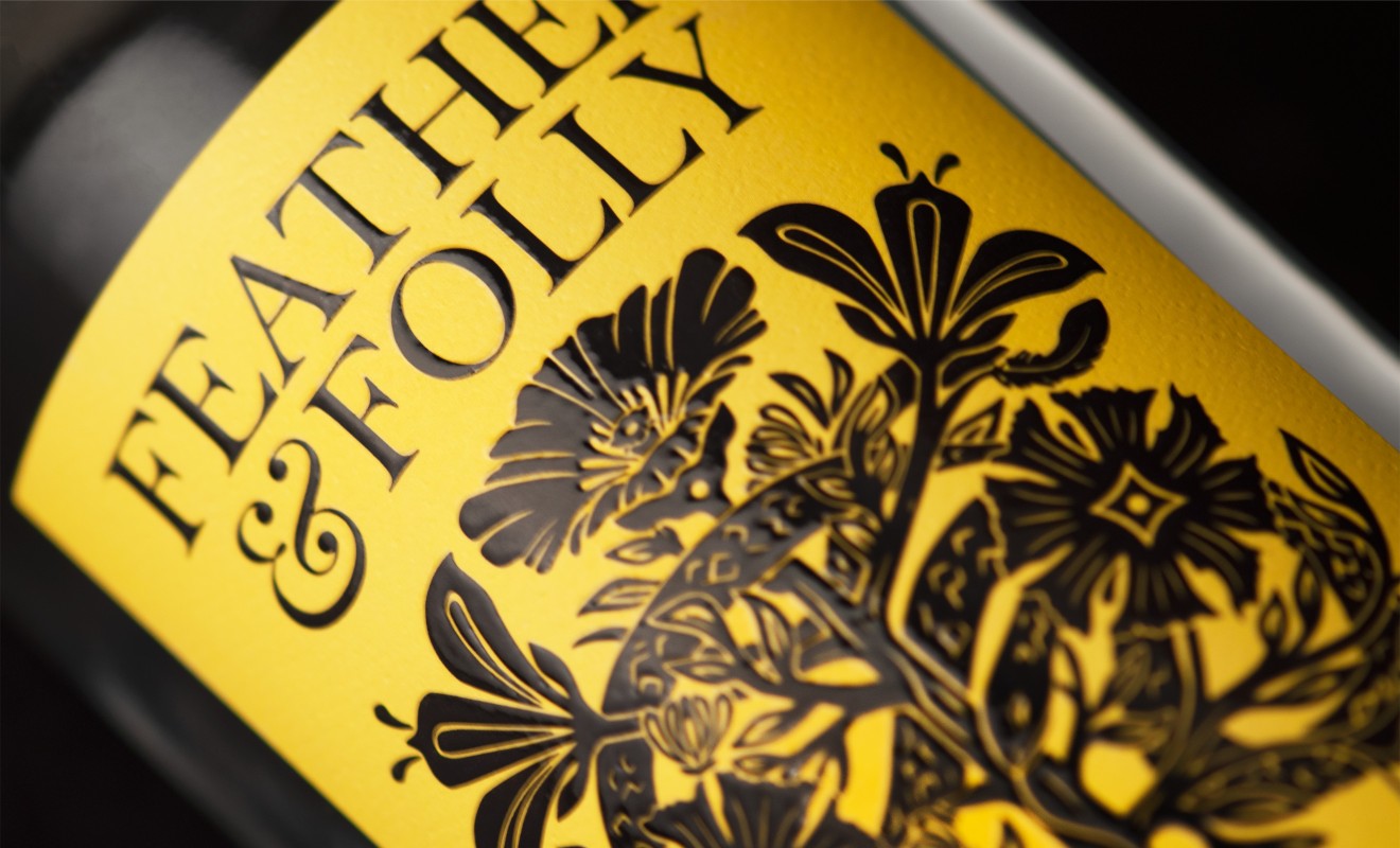
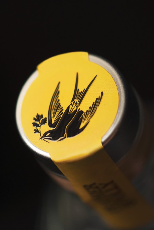
CF Napa developed the name Feather & Folly to express a free-spirited personality and provide a wink back to Goose Ridge. The tattoo-style illustration makes use of the age-old symbolism of the Garden of Eden and depicts the balance of free will and the folly of human nature through the hidden symbology of the serpent in pursuit of the bird.


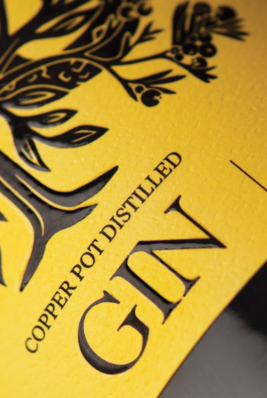
Key botanical ingredients of the gin along with other flora are woven throughout the illustration. The bright yellow of the label was selected for its optimistic and youthful connotations while providing a fresh fruit-forward flavor cue and an ownable brand color within the competitive landscape of gin.

