Woodbridge by Robert Mondavi

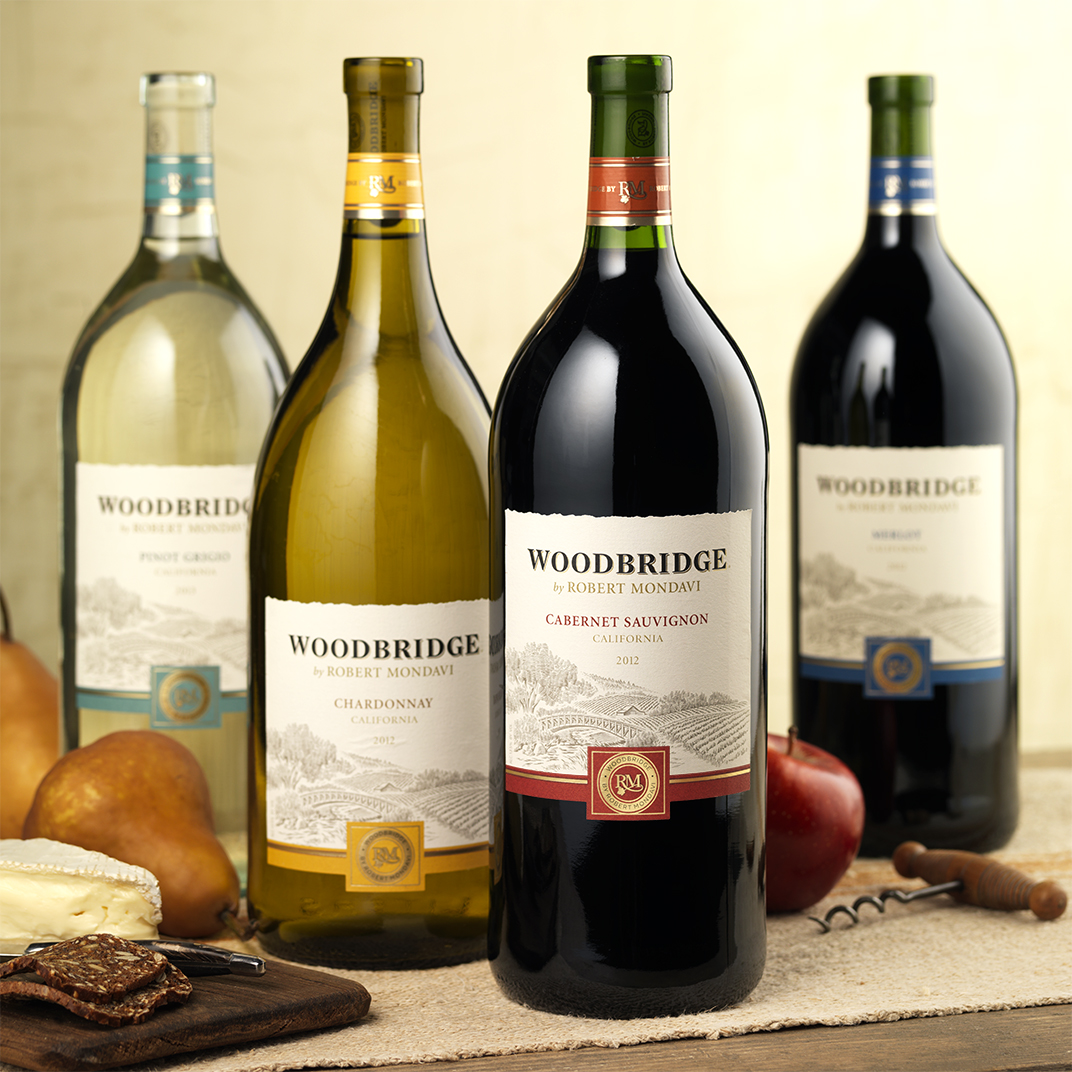
Constellation Brands asked CF Napa to redesign Woodbridge, their largest brand in volume, to feel more premium, to create a sense of place, and to better communicate the endorsement by Robert Mondavi.
Client
Constellation Brands U.S.
Country
United States
Project Scope
Logo
Packaging
Marketing

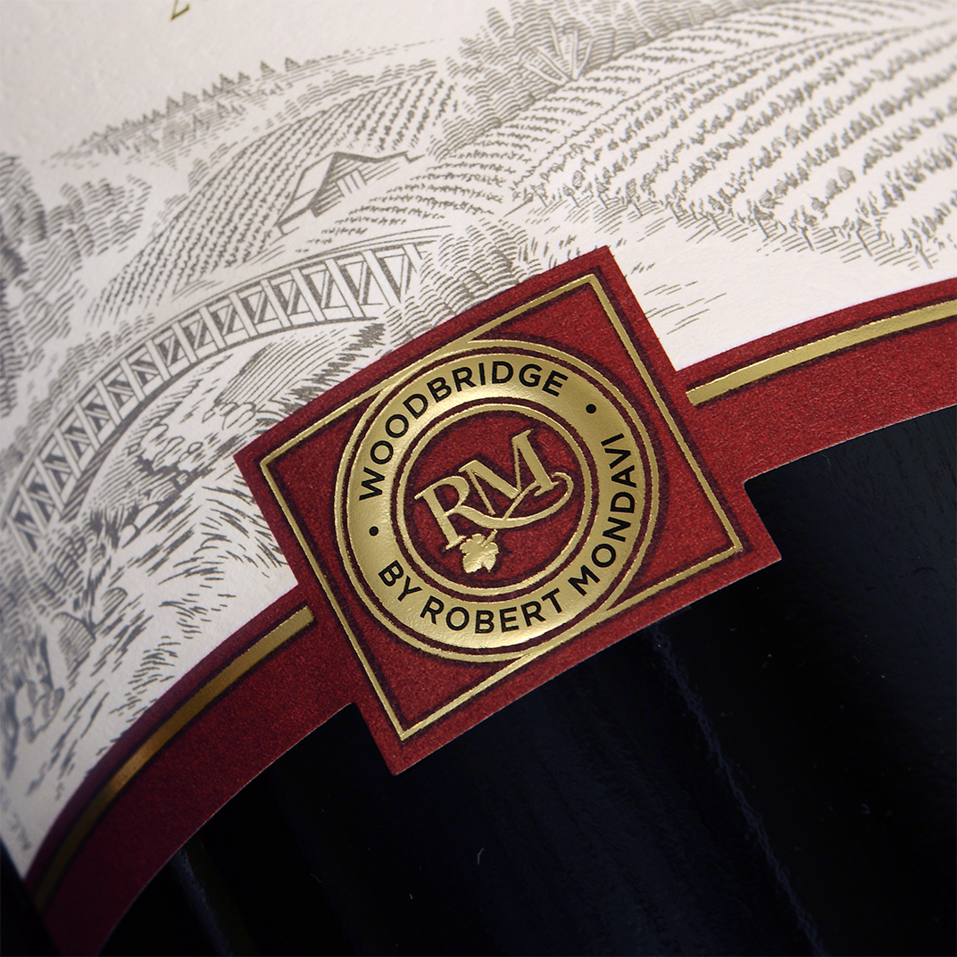
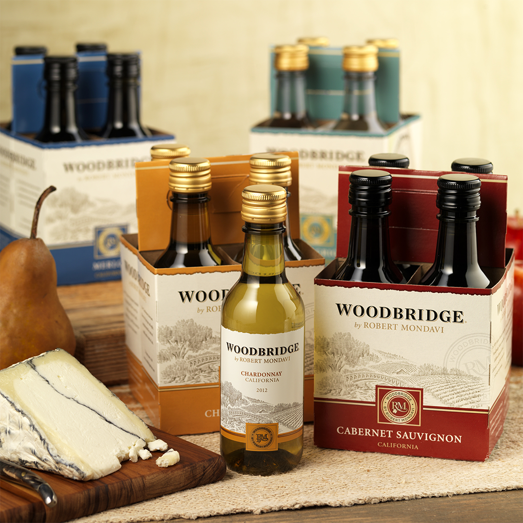
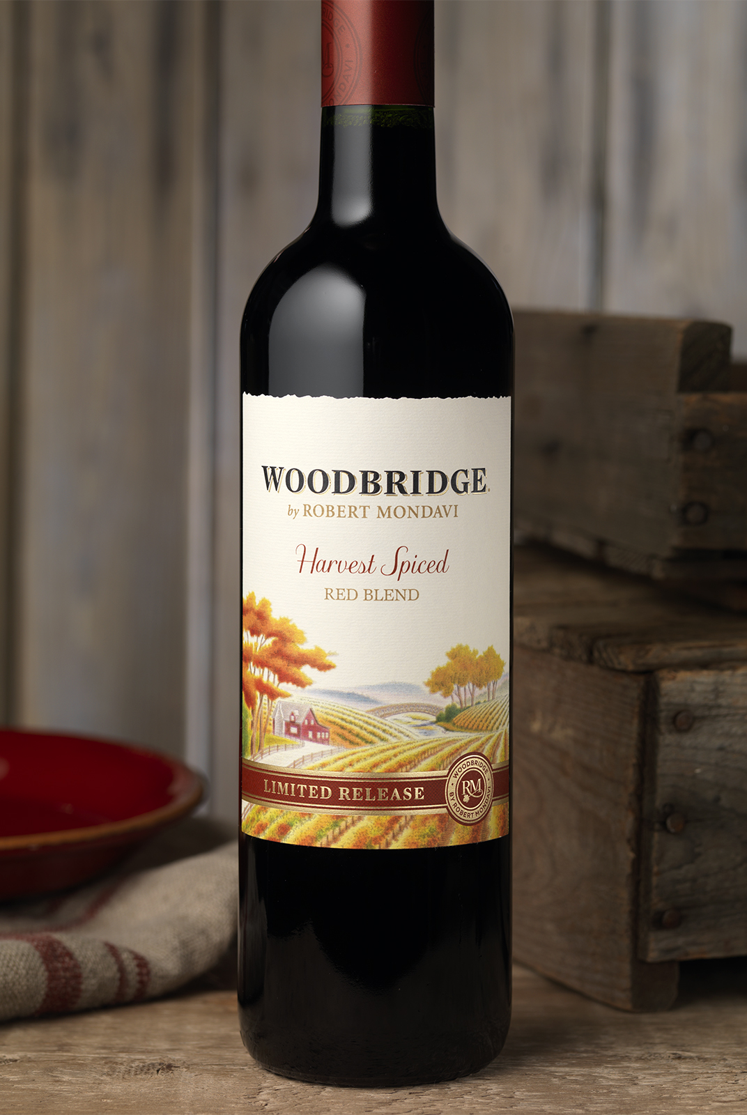
The packaging was redesigned with a new illustration that invites the consumer into the vineyard scene by crossing the wood bridge. The wordmark was redesigned to be more readable and quality indicators like the seal and better flavor communicators through the new color system per varietal were incorporated.
