Line 39

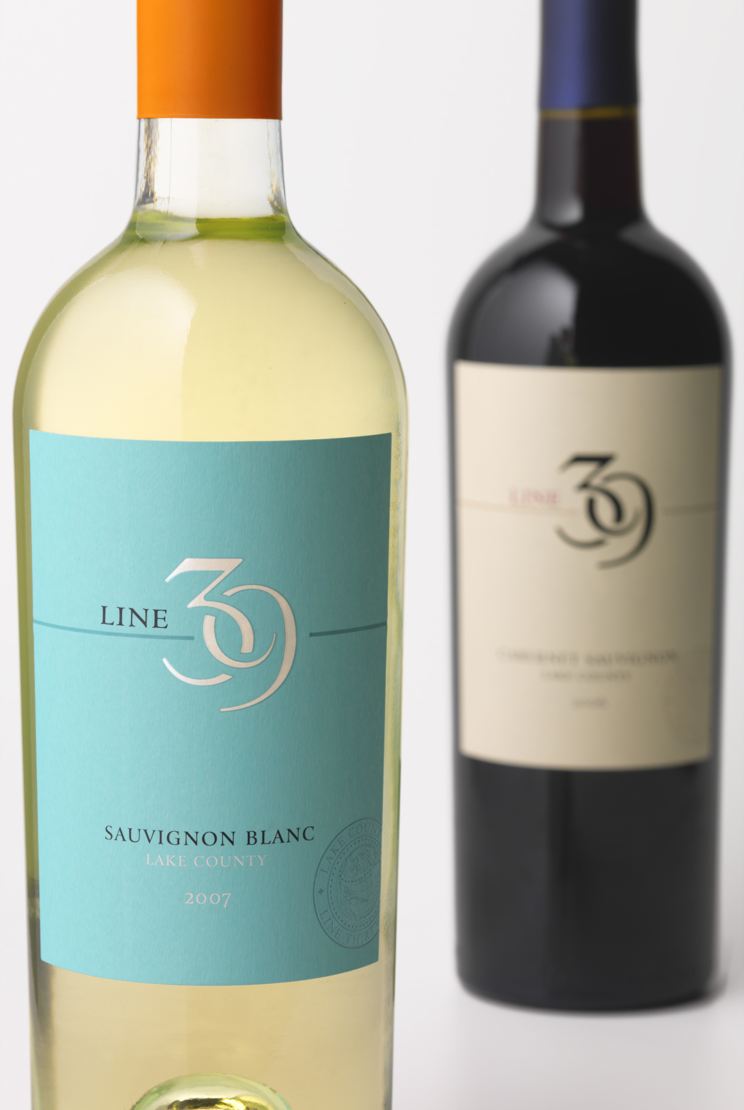
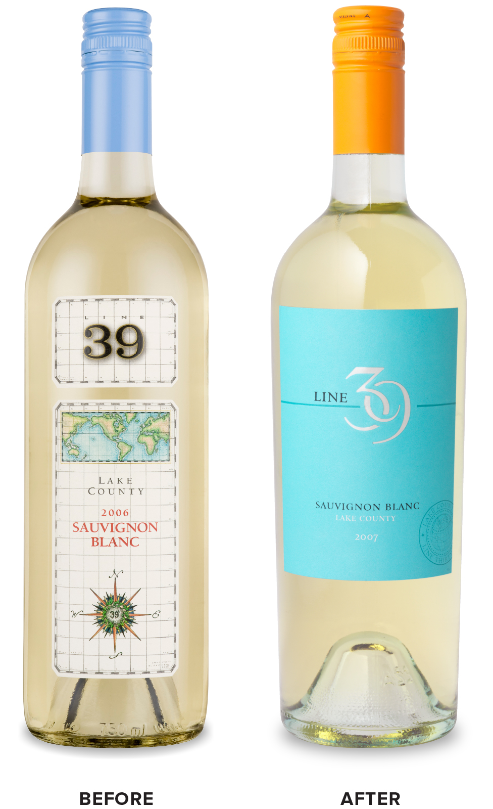
CF Napa illustrated the story behind the name Line 39 – the latitude of some of the finest wine-growing regions in the world – in a more abstract and modern way.
Client
O'Neill Vintners & Distillers
Country
United States
Project Scope
Naming
Logo
Packaging
Awards
2008 Beverage Testing Institute World Wine Championships - Bronze, Graphic Design
2009 Beverage Dynamics Advertising & Promotion Awards - Second Place, Redesigned Label/Packaging
2009 GDUSA - American Graphic Design Awards
2010 Trademarks USA - American Pixel Academy
2011 Los Angeles International Wine Competition - Silver, Color & Type
Show More


It was very important for the brand name to be strong, even symbol like, for better brand recognition.
Once the icon was developed, CF Napa worked with strong, unique colors to optimize shelf impact and to strongly appeal to the consumer target base. The turquoise was selected for the white wine for a predominately female base while the cream background for the red varietals was tailored for a strong male consumer base.


