Farm Stand

Farm Stand came to CF Napa with the task of developing an organic RTD brand that would have the elasticity to work across both hard cider and hard seltzer categories.
Client
Coppercraft Distillery
Country
United States
Project Scope
Logo
Packaging
Awards
2021 Packaging of the World
2021 World Brand Design Society

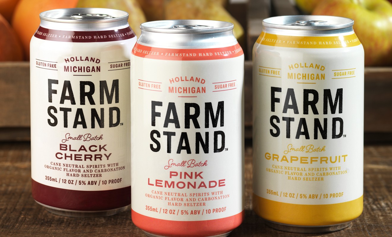
The name “Farm Stand” evokes the imagery of a local grower selling the latest fruits of their harvest alongside a country road. CF Napa harnessed this to design the hard cider packaging, putting a modern twist on a farmers’ market sensibility. The crisp white sleeve with distressed block type calls to mind the handmade signs found on display at so many fruit stands. A stripe of color and friendly script were utilized to differentiate between flavors.

For the hard seltzer, we maintained the approachable, farmers’ market look while adding pops of color to provide enhanced flavor cues and to draw attention to the beverages’ gluten free and sugar free promises.
