The Gin Foundry

The Trade Route Collection by The Gin Foundry follows ancient waterways to source the best botanicals and spices used to craft their distinctive gins.
Client
The Gin Foundry
Country
United States
Project Scope
Logo
Packaging
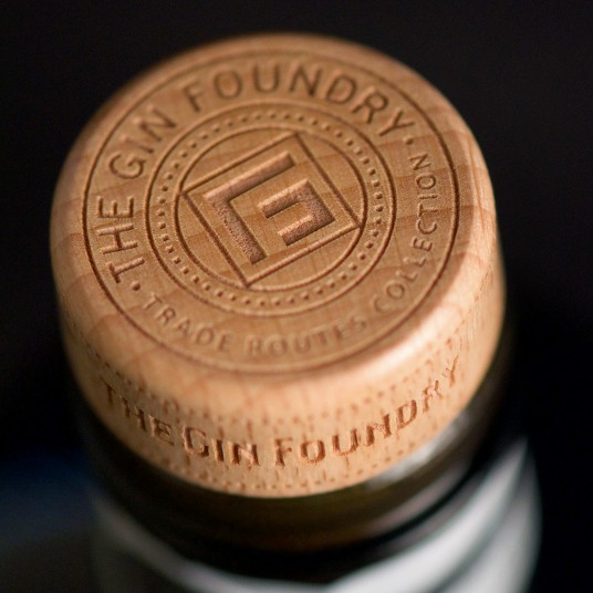
Custom Bottles
Print
Awards
2017 Packaging of the World
2018 Creative Quarterly 49
2018 Graphis Branding 7 - Gold
2018 Graphis Typography 4 - Gold
2020 World Brand Design Society
2022 Packaging of the World
2022 World Brand Design Society
2022 World Gin Awards - Silver, Best Label Design


The packaging needed to be evocative, capturing the exotic trade routes, while remaining flexible enough to customize each regionally inspired gin.


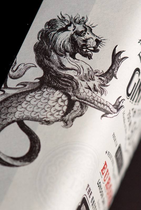
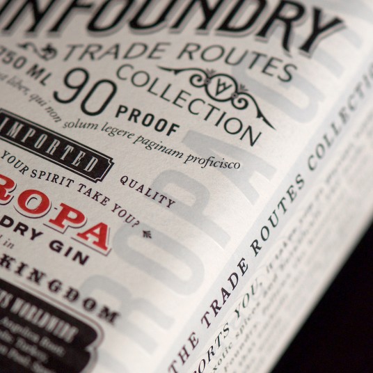
CF Napa designed the custom bottle to evoke old apothecary bottles and medicinal gins. The label, inspired by historic maps and period typography, also incorporates etchings of the mythical creatures often depicted on maps of the legendary trade routes. A Mediterranean blue and a sea monster illustration were chosen for the Europa Gin, while the Far East Gin received a pale red and a dragon. The result was a beautifully layered and richly textured label, with embossing and foil over stamping.


