Roots Run Deep Marketing

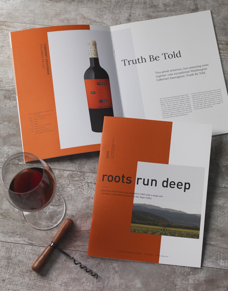
Roots Run Deep came to CF Napa to reimagine their brand brochure into a more premium marketing asset and a visual brand storybook.

The winery follows a house of brands model with each one taking on its own individual design, so it was imperative that the brochure found a connecting thread to unify the brands.
CF Napa created a brochure with streamlined copy that accompanied the vineyard photography and bottle shots to tell the brand story in easily scannable paragraphs. Roots Run Deep’s iconic burnt orange color scheme was utilized to provide a through-line to each of the five brands.


