Ram’s Gate

Ram’s Gate engaged CF Napa to refresh their wine packaging to reflect a more youthful, modern and feminine sensibility without alienating their loyal customer base.
Client
Ram’s Gate
Country
United States
Project Scope
Logo
Packaging
Awards
2021 Packaging of the World
2021 World Brand Design

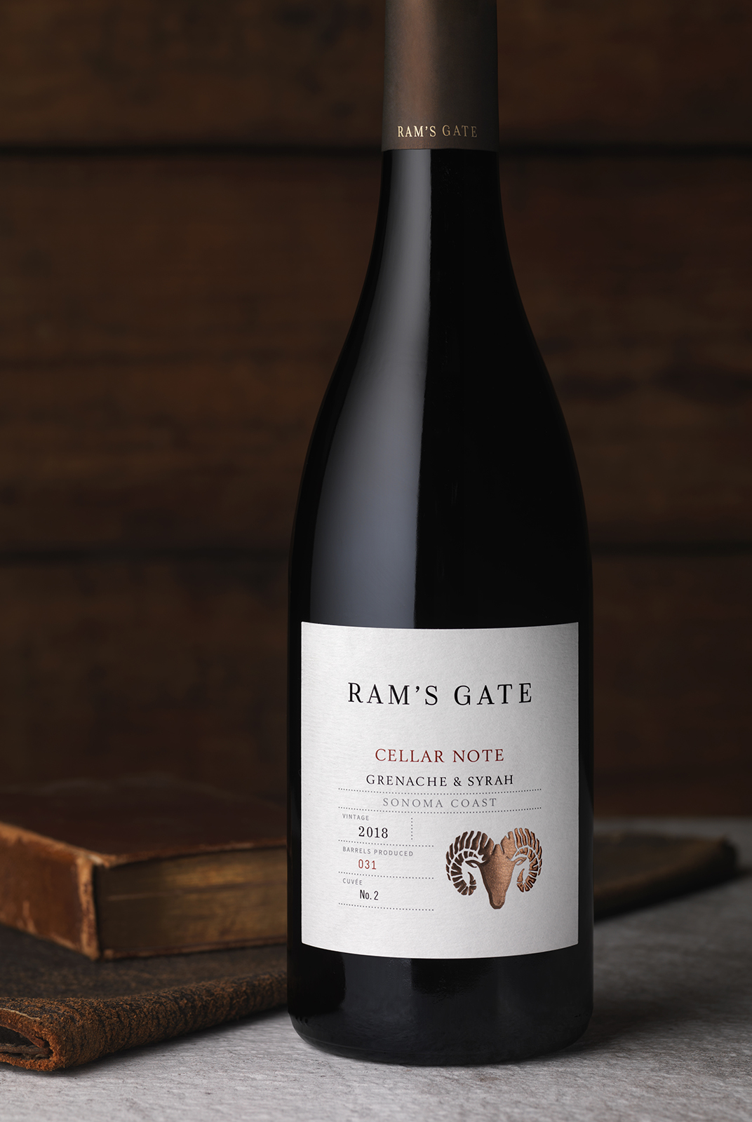
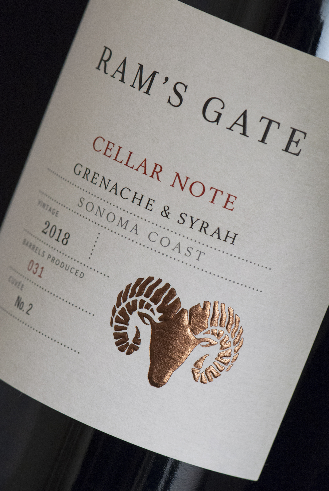
The Cellar Note Tier was designed for the wine enthusiast, providing transparency by showcasing the wines’ technical aspects on the front label.
Additionally, they needed to create greater differentiation between their tiers while maintaining a cohesive family look.
The base tier utilized a silver foil and a left-aligned type stack to evoke the casual, easy-drinking nature of the wines.
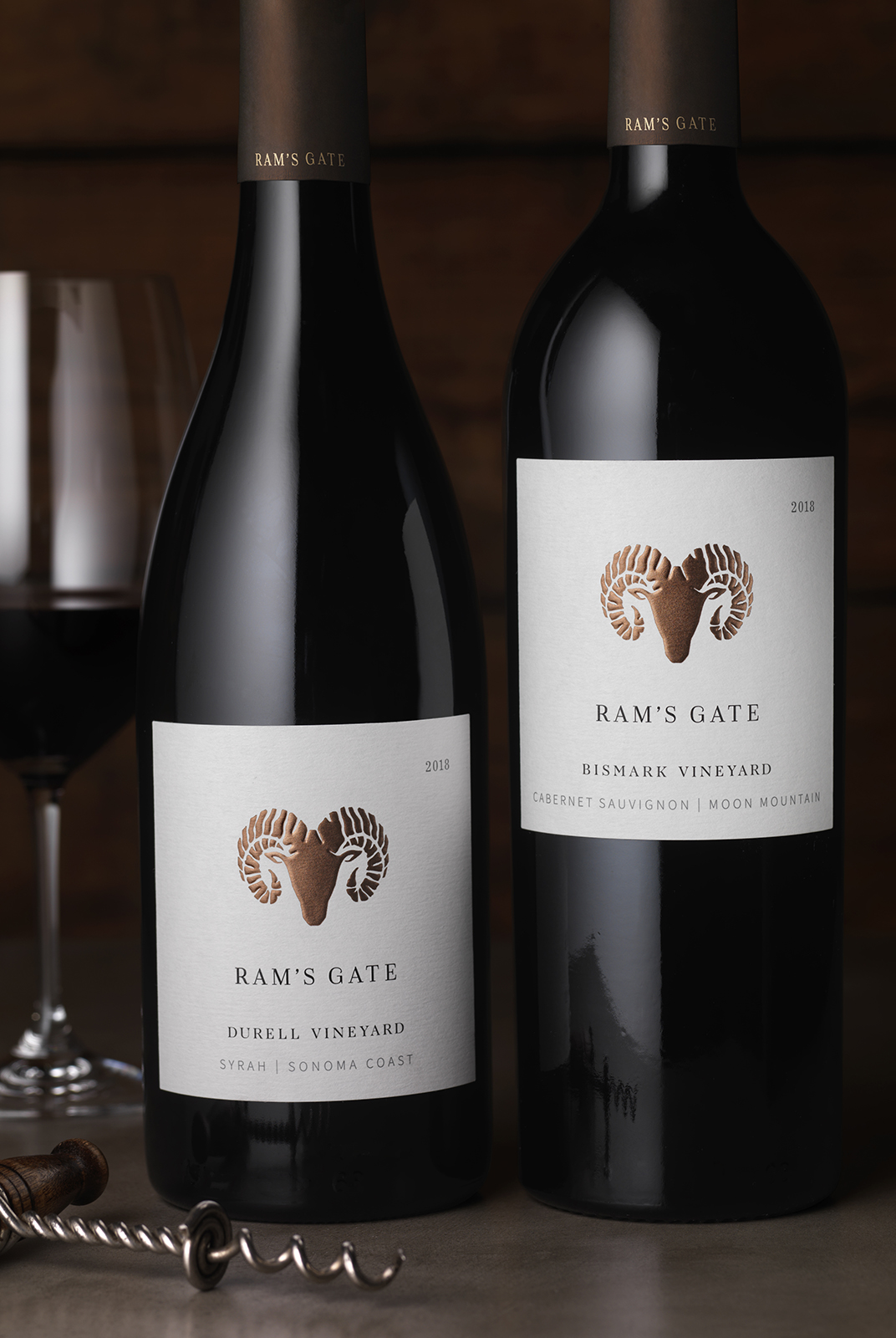

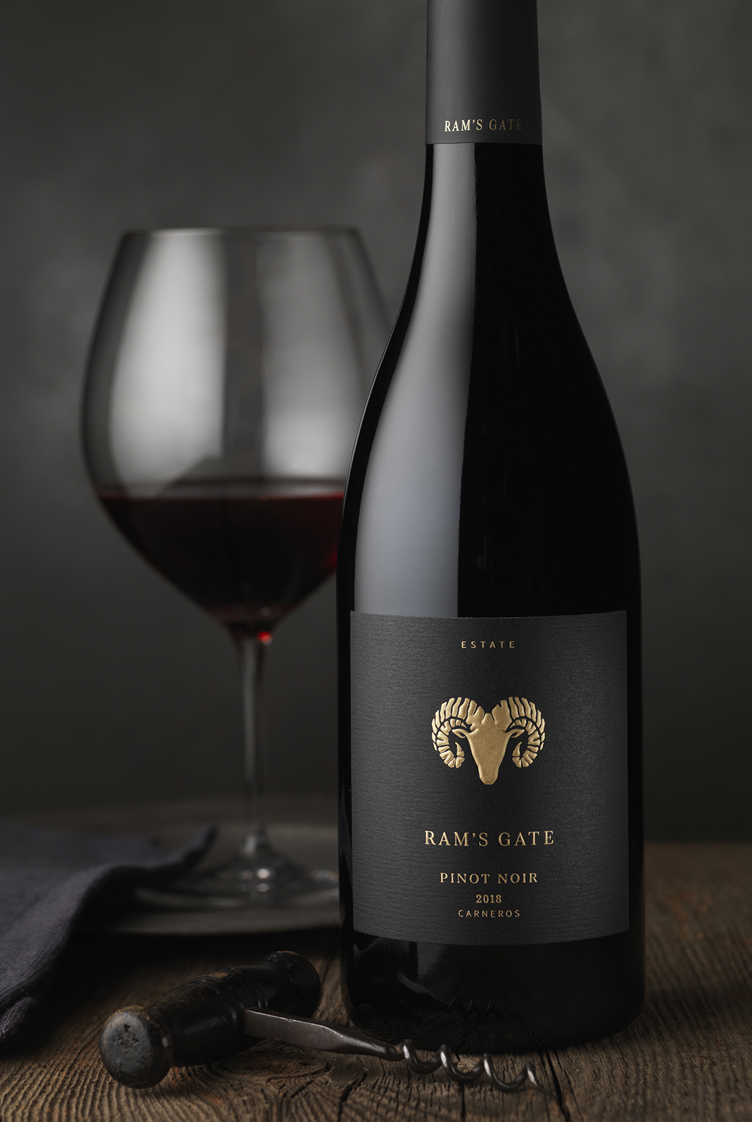
As the wines laddered up, the label hierarchy followed a more traditional structure with increasingly minimal text, finally culminating with the Estate Tier’s elegant black color scheme and gilded ram's head.
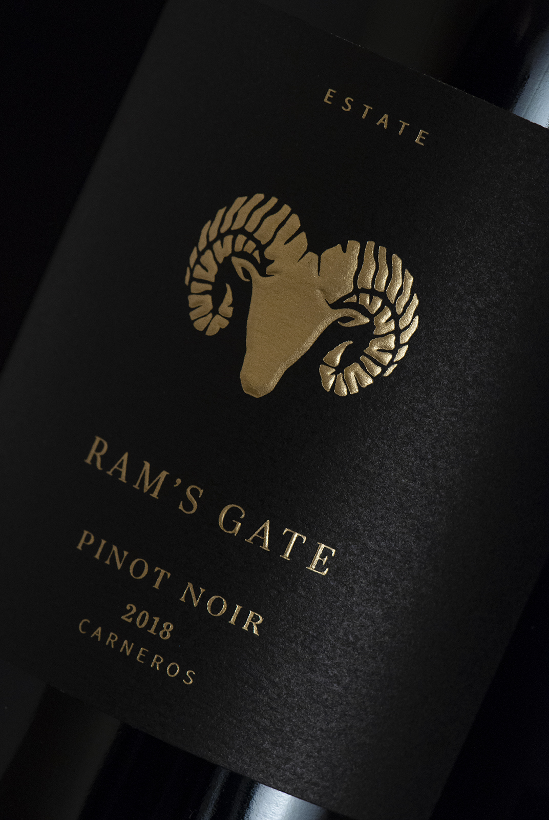

CF Napa re-illustrated the winery’s iconic ram’s head logo utilizing a minimalistic silhouette – giving it a more organic, handcrafted feel. This new logo became the common thread that connected the wines, and its placement on the label and foil treatment color transformed across tiers, further aiding in differentiation.


