Search
Oberon
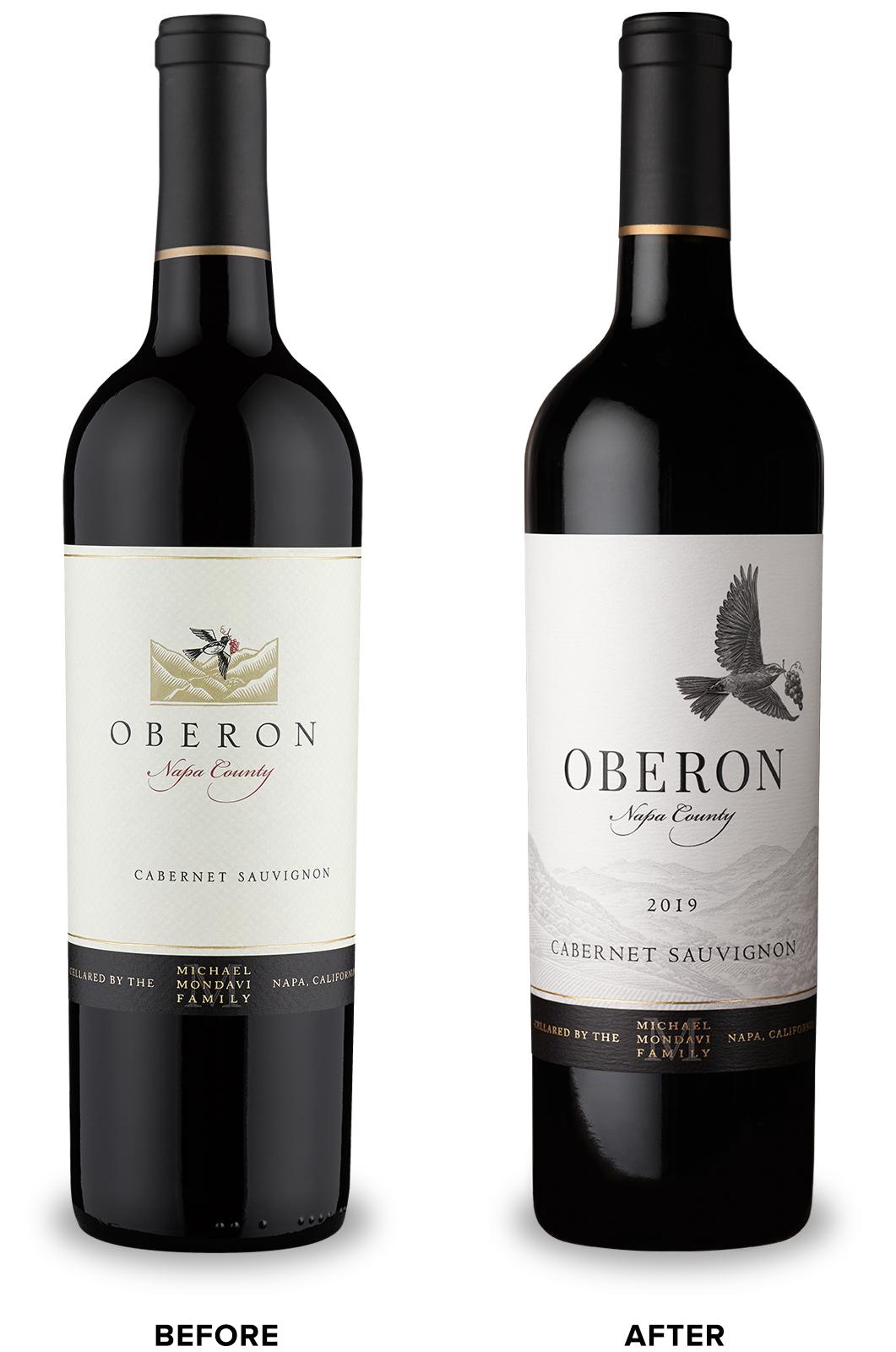
Folio Fine Wine Partners came to CF Napa to refresh their important Napa Valley brand, Oberon, to stand out as a premium choice against the competitive set.
Client
Folio Fine Wine Partners
Country
United States
Project Scope
Brand Portfolio Architecture
Logo
Packaging
Marketing
Awards
2022 Packaging of the World
2022 World Brand Design Society
The primary objective of the redesign was both to revitalize the brand by increasing its shelf presence and to increase premium quality cues.
CF Napa began by accessing the brand’s key equity elements; the morning lark inspired by Shakespeare’s “A Midsummer’s Night’s Dream” and the illustration of the Napa Valley countryside. CF Napa re-envisioned the lark to be more iconic, detailed and less whimsical and increased both its size and dramatic prominence on the label. The landscape scene was illustrated to be more accurate to the look of the vast Napa Valley. The Oberon wordmark was redesigned to be more readable and premium. The final touch was a gloss hi-build to highlight the lark, catching the light as the final wink to grab consumer attention.
Following the redesign of their Oberon brand, Folio Fine Wine Partners returned to CF Napa to create a memorable design for their new Paso Robles Cabernet Sauvignon offering. The label needed to feel a part of the Oberon family while taking on the slightly edgier, more contemporary feel that Paso Robles brands typically exhibit.
CF Napa reimagined the Oberon lark as if caught mid-flight, escaping from the confines of the label. Within the bird’s wingspan, a sharp-eyed observer will find a scenic view of Paso Robles including the rolling hills lined with vineyards and dotted with oak trees. The embossed feathers of the lark continue the vineyard pattern and add textural interest to the label.
CF Napa reimagined the Oberon lark as if caught mid-flight, escaping from the confines of the label. Within the bird’s wingspan, a sharp-eyed observer will find a scenic view of Paso Robles including the rolling hills lined with vineyards and dotted with oak trees. The embossed feathers of the lark continue the vineyard pattern and add textural interest to the label.