Martin Ray Vineyards & Winery
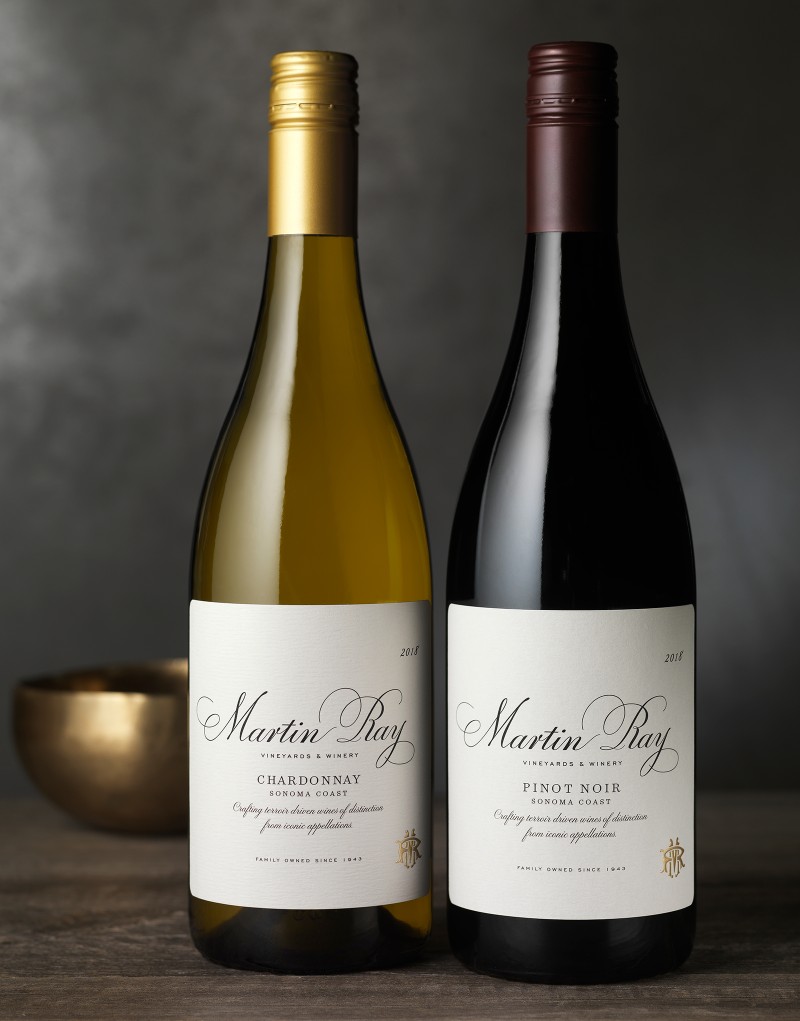
Martin Ray Vineyards & Winery came to CF Napa to refresh their wine packaging to be more premium in order to compete with big-name wines that have cult-like followings.
Client
Martin Ray Vineyards & Winery
Country
United States
Project Scope
Logo
Packaging
Digital
Visit

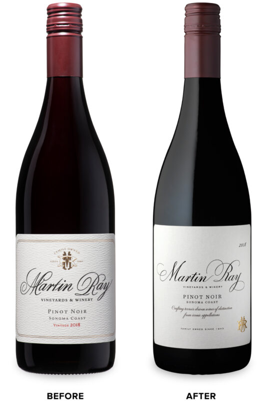
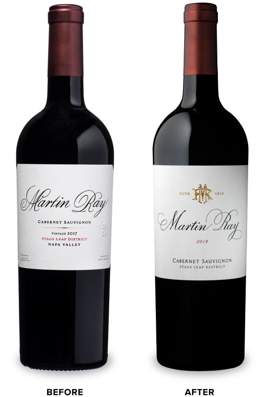
As a well-known, historical winery, it was crucial that the new design was respectful to the brand’s equity elements, history and legacy, yet capture a more contemporary sensibility.
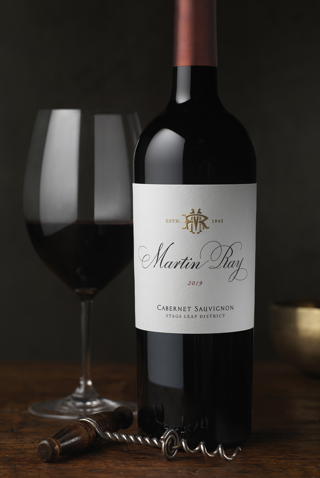
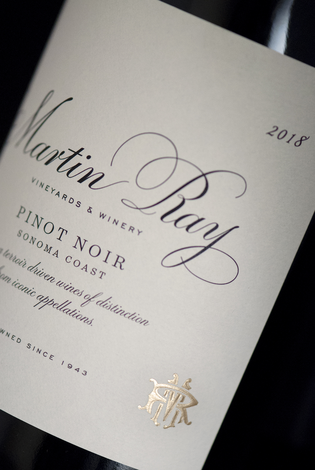
The Martin Ray script was redrawn as a custom wordmark to both modernize and improve readability yet retain the elegance of the original script. Nomenclature was added to the label to communicate the brand’s story and family-owned roots.


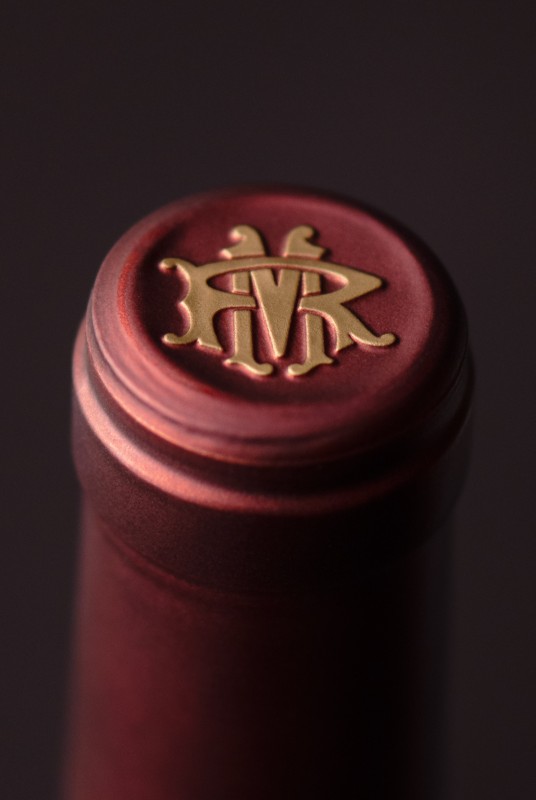
Finally, the brand’s monogram was redrawn to work as a beautiful sculptured emboss seal as the final touch, elevating the brand to the status it deserves.

Following the redesign of their multi-tier wine portfolio, Martin Ray Vineyards & Winery returned to CF Napa to create the design for their Méthode Traditionnelle sparkling wines – marking the first release of sparkling wines for the brand.
The redrawn Martin Ray script and monogram created the main graphic for the label. Gold foil treatments make the wine specs and intricate label border details pop. Neck labels with the Martin Ray monogram and the pearlescent paper used for the main label are reminiscent of trends seen in traditional Champagne packaging. These wines, many years in the making, create a celebratory addition to the Martin Ray family.
The redrawn Martin Ray script and monogram created the main graphic for the label. Gold foil treatments make the wine specs and intricate label border details pop. Neck labels with the Martin Ray monogram and the pearlescent paper used for the main label are reminiscent of trends seen in traditional Champagne packaging. These wines, many years in the making, create a celebratory addition to the Martin Ray family.


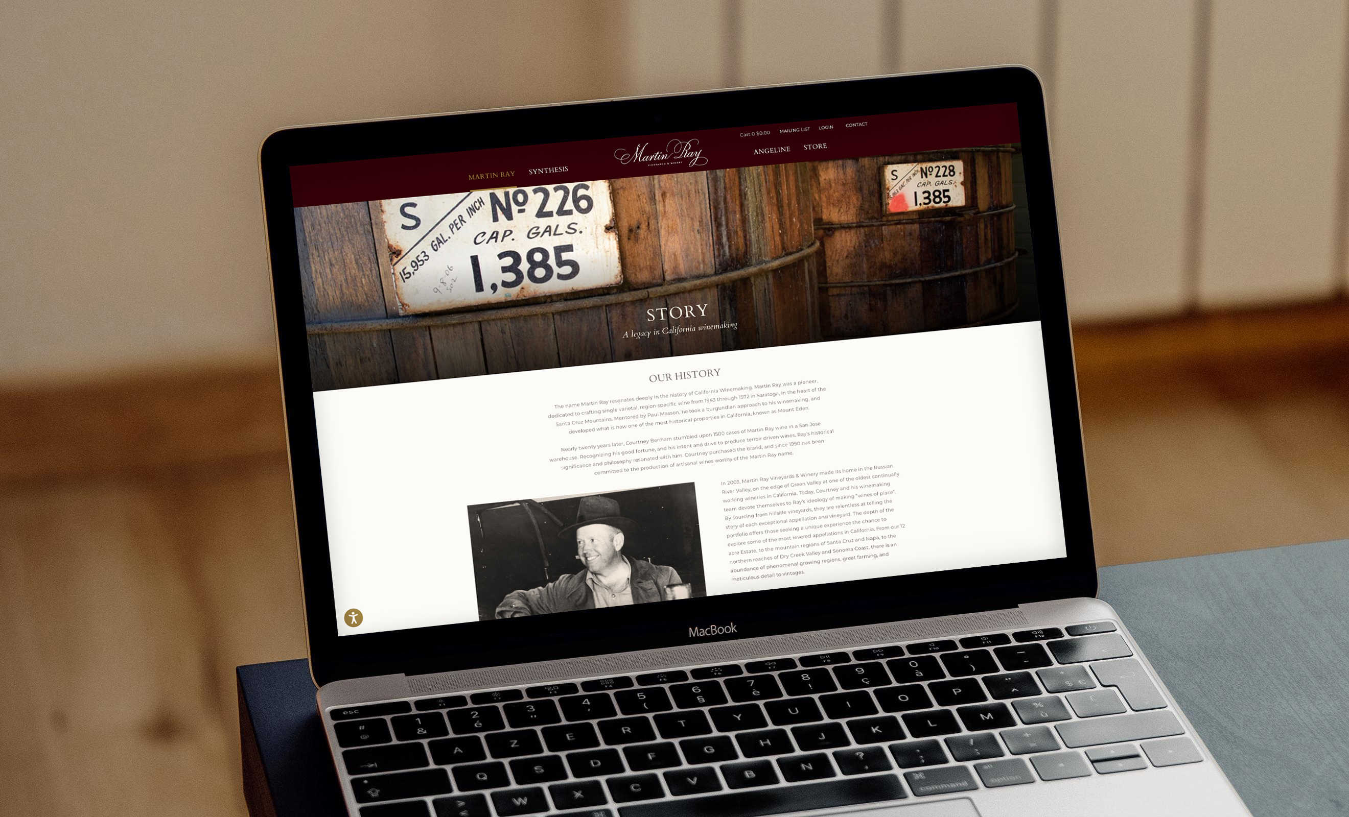
CF Napa created an editorial-style landing page that included imagery for Martin Ray, Synthesis, and Angeline with links to each of the brand’s respective subpages. Each section leveraged the look and feel of the new brand packaging.
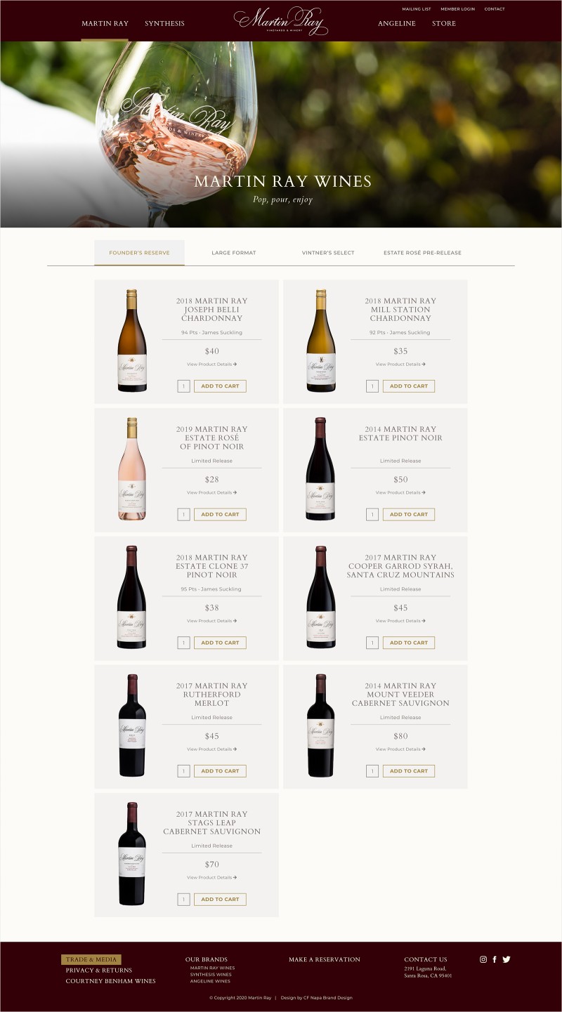
The new store section allowed consumers to purchase all wines and mix and match brands. High-quality photography and a mobile-first approach to the site resulted in a fresh new look and feel and an immersive consumer experience.
