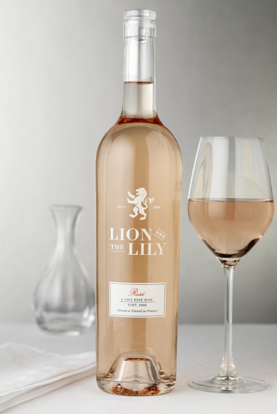
Lion and the Lily

Bordeaux cooperative Les Vignerons de Tutiac came to CF Napa with the goal of developing a new brand for the US Market.
Client
Les Vignerons de Tutiac
Country
France
Project Scope
Naming
Logo
Packaging
Awards
2021 Packaging of the World


The goal was to create a line of wines that simultaneously stayed true to their French heritage while also capturing a fresh, contemporary aesthetic that would have wide appeal for the American wine consumer.

CF Napa developed the name Lion and the Lily - inspired by the Bordeaux region’s coat of arms which proudly boasts both symbols. A lion with a tail that doubles as a lily flower became the central icon on the labels. The clean, modern packaging was intentionally designed in contrast to the traditional French wine labels that are often intimidating to US consumers. Gold foil and embossed details exude luxury and are the final touch to this beautiful new brand.


