Kitá

Founded in 2010, Kitá Wines is a small, premium winery located in the heart of the Santa Ynez Valley within the Santa Barbara County AVA.
Client
Kitá Wines
Country
United States
Project Scope
Naming
Logo
Packaging
Awards
2013 GDUSA - American Graphic Design Awards
2014 San Francisco Chronicle Label Competition - Classical Category
2014 San Francisco International Wine Competition - Bronze, Label Design
2015 Los Angeles International Wine Competition - Silver, Effective Use of Design Standard


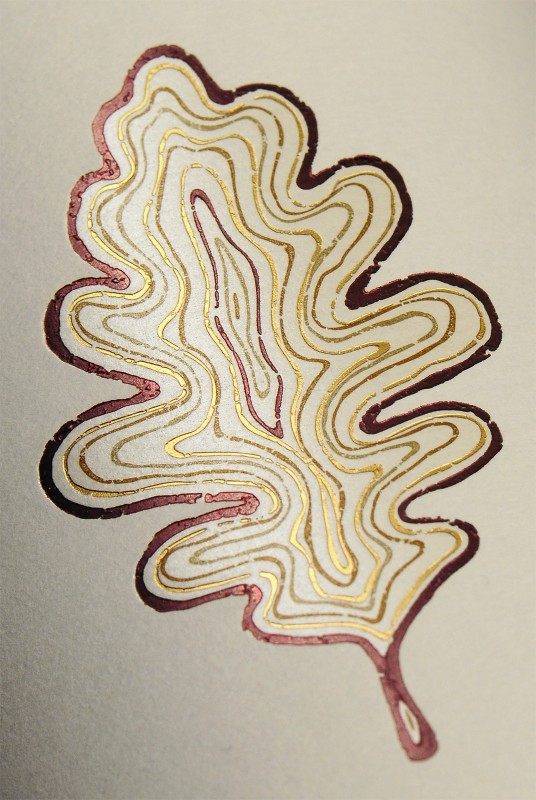
The word “Kitá” means “Our Valley Oak” in the Santa Ynez Chumash native language of Samala. The Chumash Indian tribe of Santa Ynez came to CF Napa to develop their new wine brand - paramount to the project would be to capture the incredible history of their people, ancestors, and history in the Santa Ynez Valley. Our solution was to create an icon for the brand utilizing the leaf of the oak trees that flourish in the valley. For centuries, the Chumash Indians had depended on the acorns from these trees as a primary part of their daily diet. The icon was developed to be an iconic oak leaf with the growth rings of a tree to symbolize the ancestors of the tribe through the years.

