Hardin

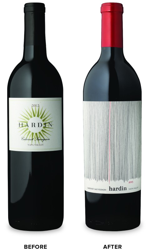
Polaner Selections came to CF Napa with an exciting Napa Valley red wine suffering from underwhelming packaging.
Client
Polaner Selections
Country
United States
Project Scope
Logo
Packaging
Awards
2017 Communication Arts Design Annual
2017 Mobius Awards - Second Place "Certificate for Outstanding Creativity"
2017 Packaging of the World
2018 GDUSA - American Package Design Award
2018 HOW International Design Awards
2018 The Pentawards - Silver
2018 San Francisco International Wine Competition - Double Gold, Label Design Competition
Show More

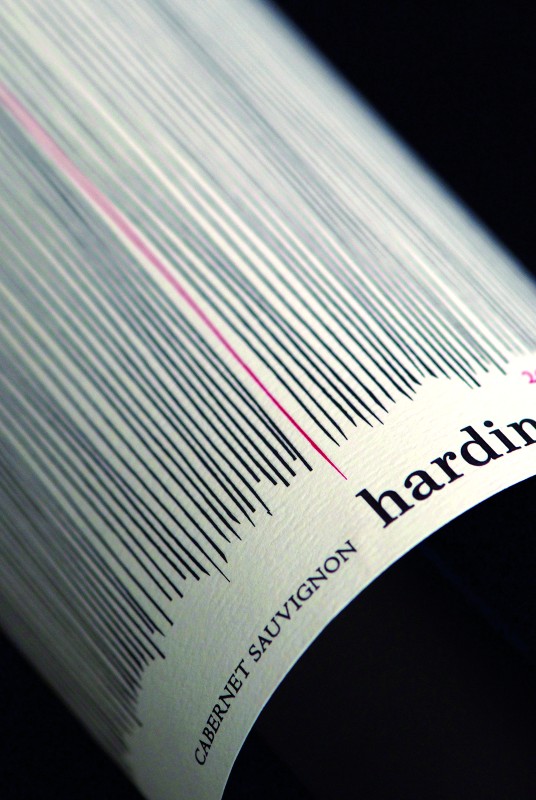
Despite being in the market for almost 10 years, customers were neglecting it in favor of more engaging competitor brands. Our objective was to redesign the brand logo and packaging to compete with the leaders in their category and feel more premium, while maintaining Hardin’s brand name and essence as a fine Napa Valley wine. Our solution was an abstract and modern design inspired by the lush textures of the wine. The highly textural expression of organic lines represent the rows of the vineyard, with a single red line representing the red wine at the center.


