Giulio Straccali
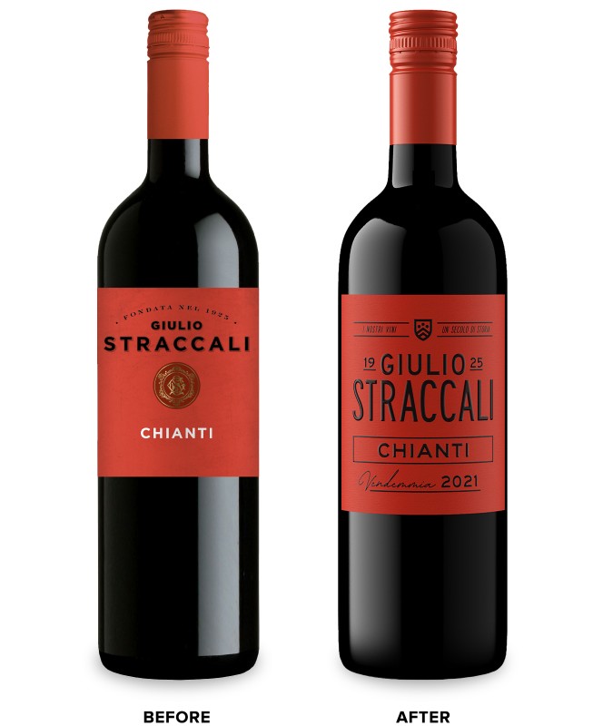
Palm Bay International came to CF Napa to refresh the Italian wine brand – Giulio Straccali.
Client
Palm Bay International
Country
Italy
Project Scope
Brand Strategy
Story Development
Logo
Packaging
Marketing
Awards
2023 GDUSA American Graphic Design Awards
2023 San Francisco International Wine Competition - Gold
2024 Communication Arts Typography
2024 GDUSA American Package Design Awards
2024 Packaging of the World
2024 World Brand Design Society
2025 Graphis Design Annual - Silver

The winery’s namesake played a key role in modernizing the production of Chianti wine in Italy and was instrumental in establishing the Gallo Nero – the black rooster symbol that became the official icon of the Chianti Classico DOCG. Now approaching the 100-year anniversary of the founding of the winery, Palm Bay International was looking to put a more contemporary spin on the packaging to attract a younger consumer to this classic Italian wine.
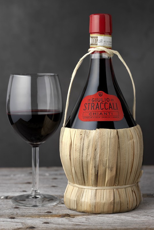

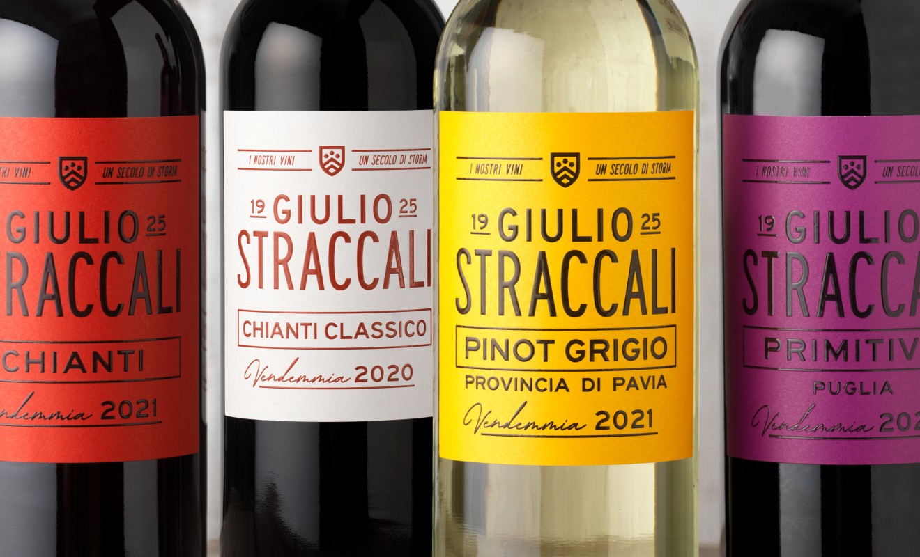
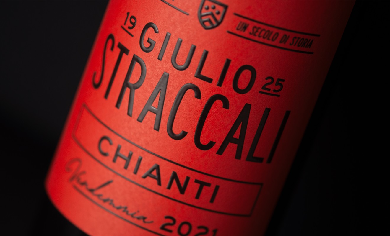
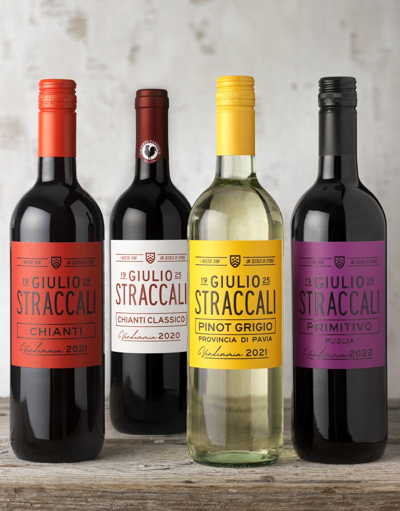
Inspired by contemporary Italian design and the promise of neighborhood Italian bistros, CF Napa developed a sleek label with sans serif font, lending a more modern, fashionable feel to the packaging while still maintaining a classic Italian sensibility. To honor the brand’s legacy, the historical crest was brought back into the packaging – the monoweight style melded perfectly with the clean, bold type. The bright color palette captured the alfresco promise of fresh, delicious wines and allowed the packaging to stand out strongly on shelf.
