Duckhorn Vineyards

Duckhorn Vineyards approached CF Napa with the task of realigning and refreshing their tiers for better differentiation and and to position the brand for growth.
Client
Duckhorn Vineyards
Country
United States
Project Scope
Logo
Packaging
Marketing

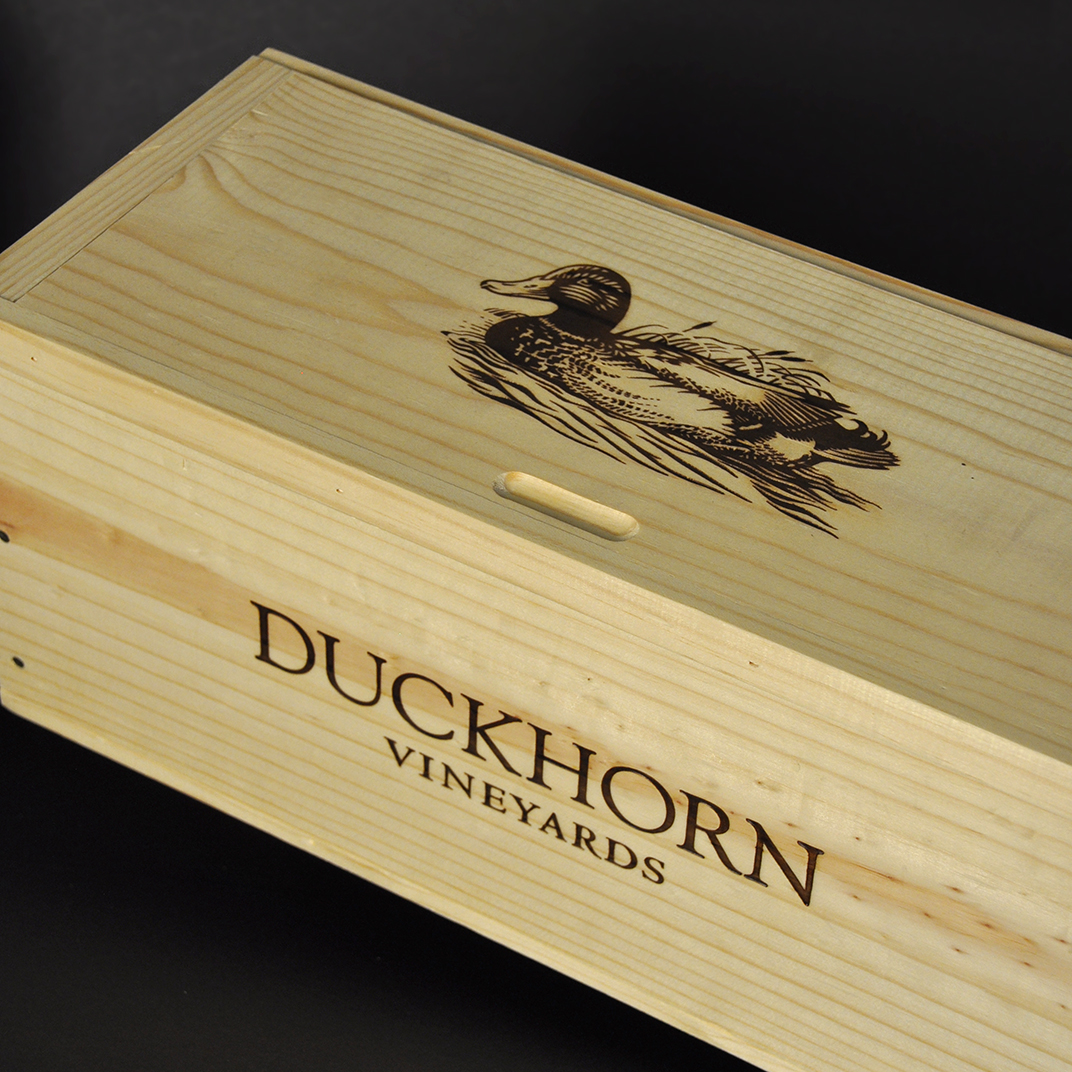
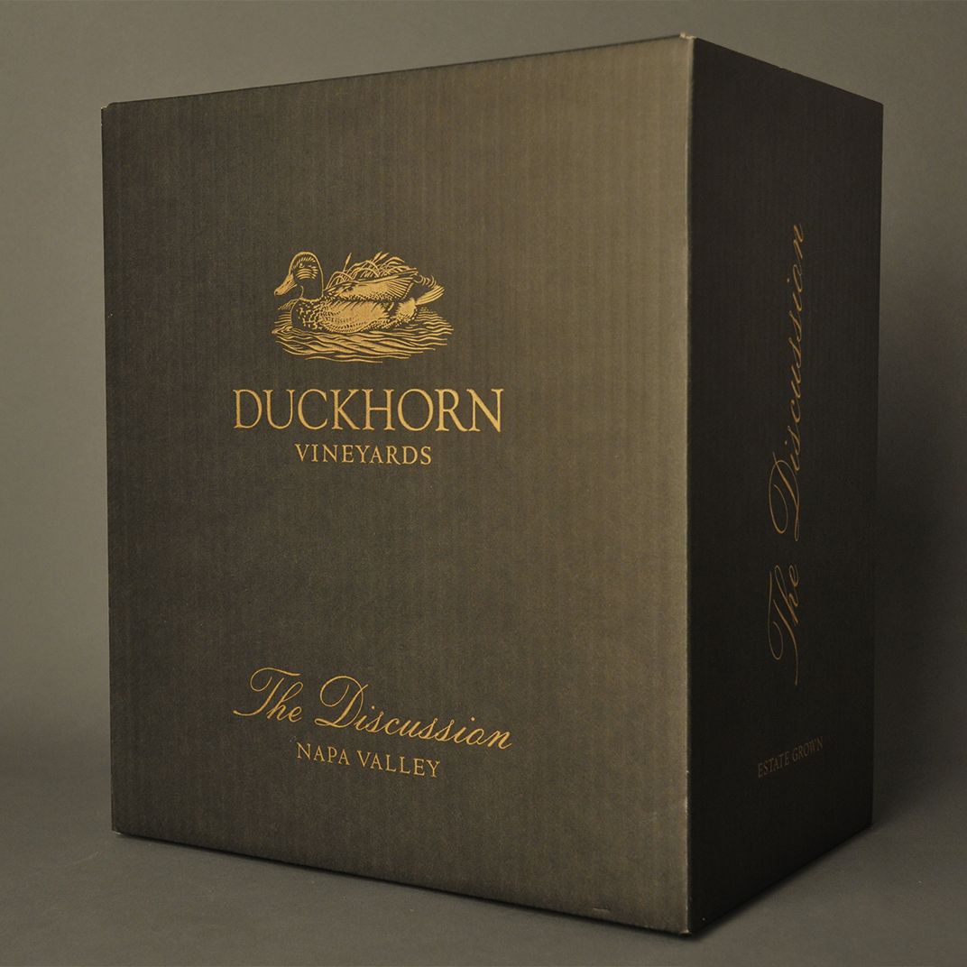
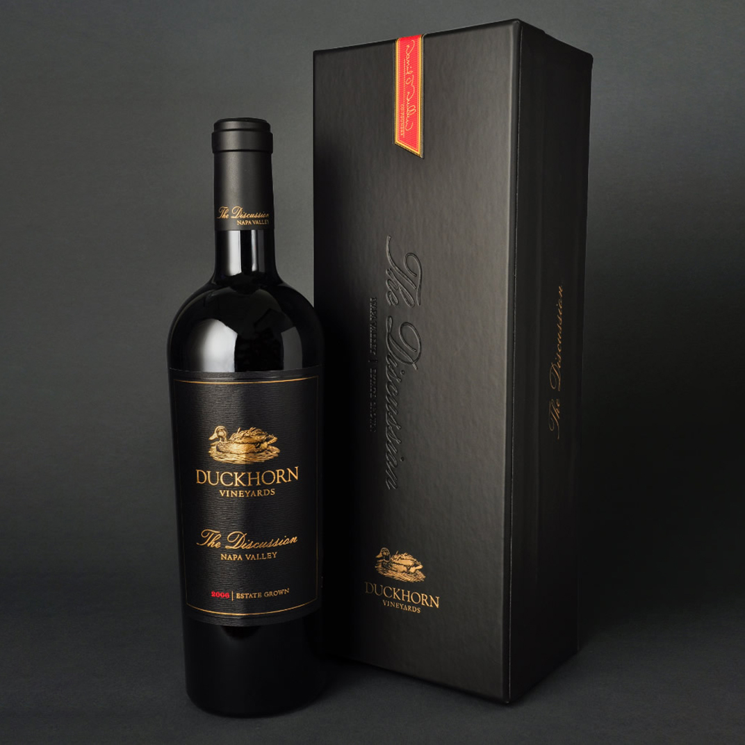
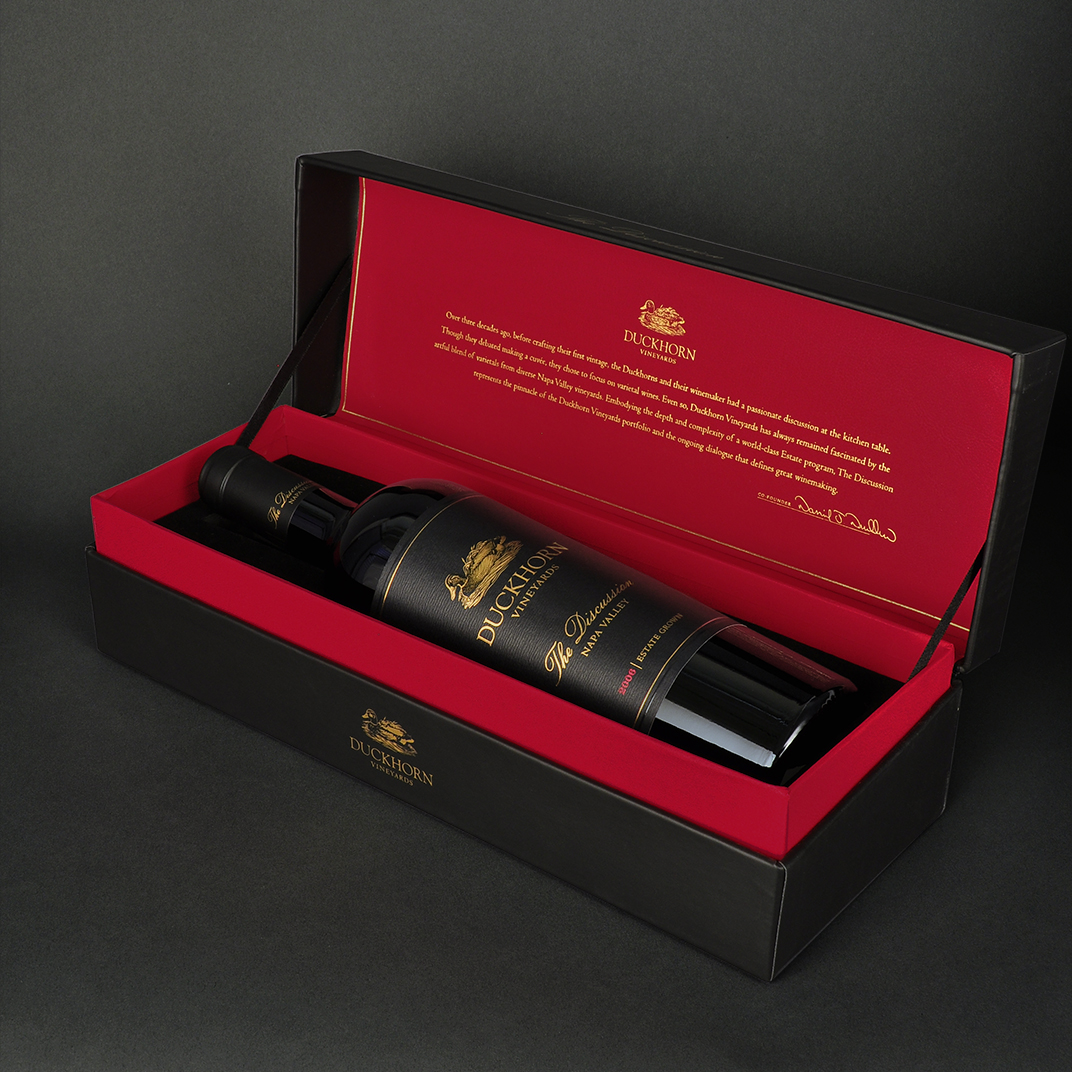
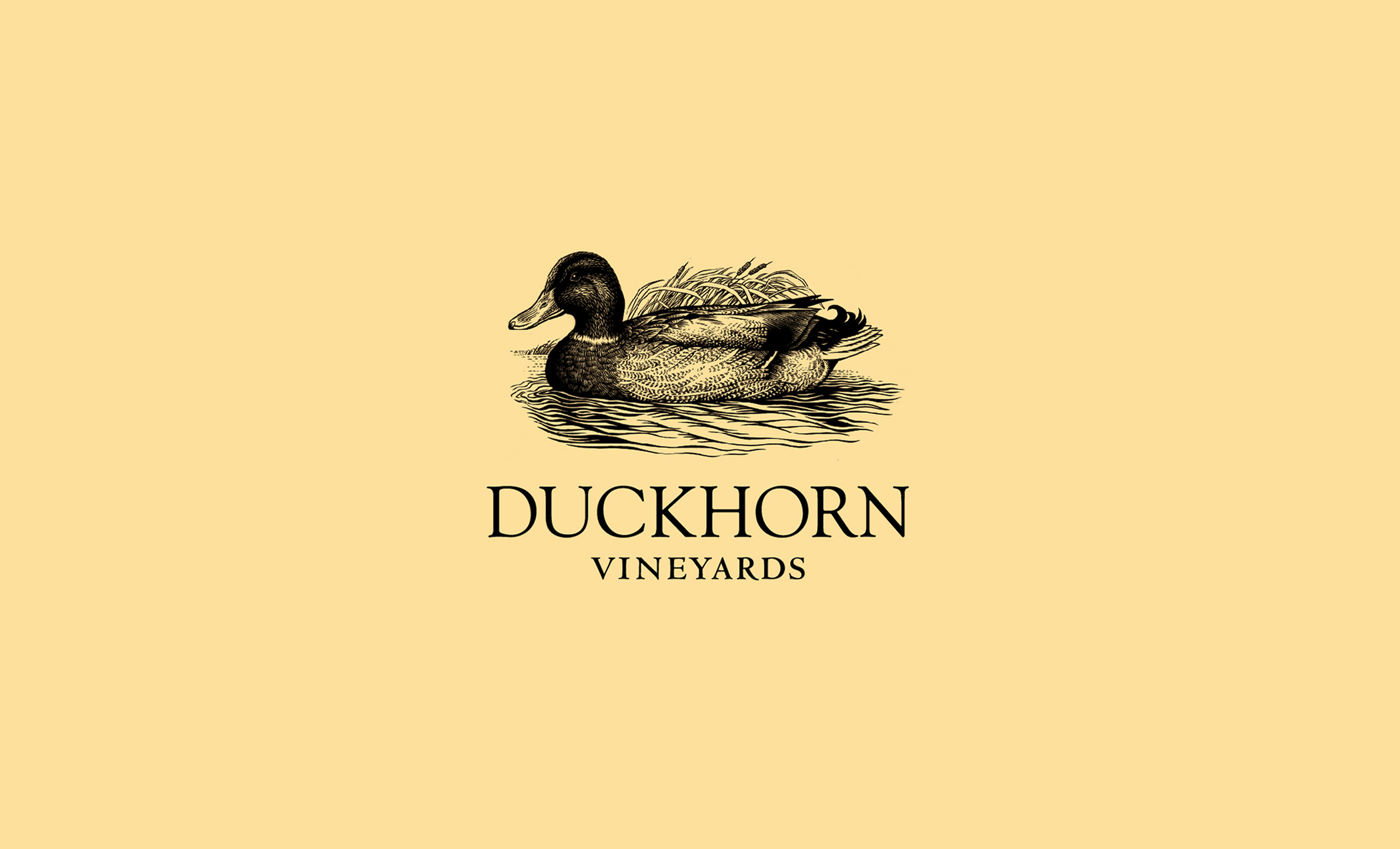
We worked with a nature artist to recreate the iconic Duckhorn mallard logo to represent an anatomically correct duck.
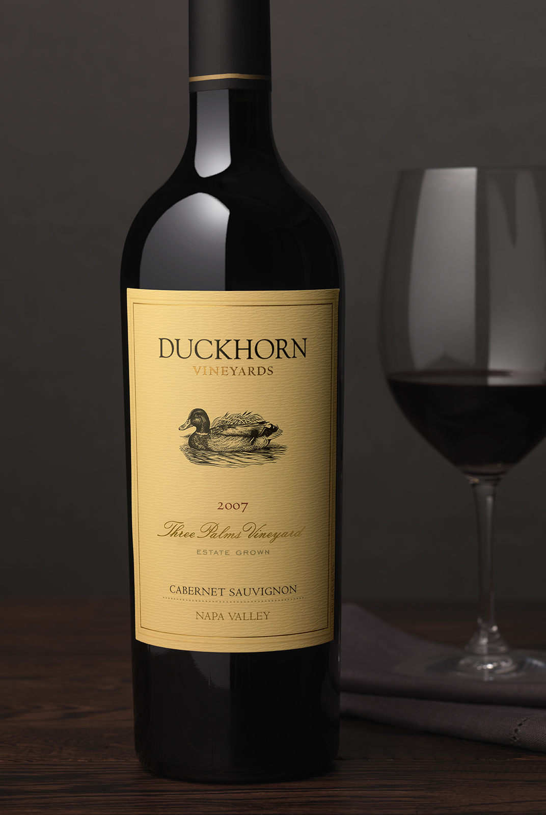
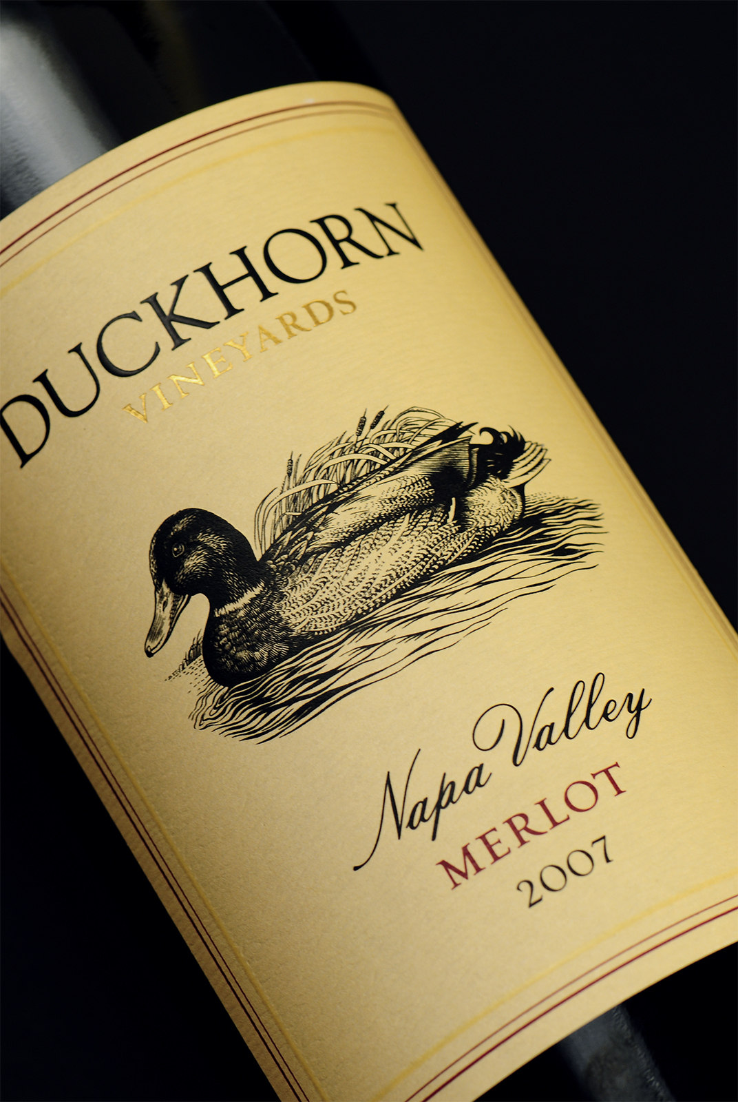
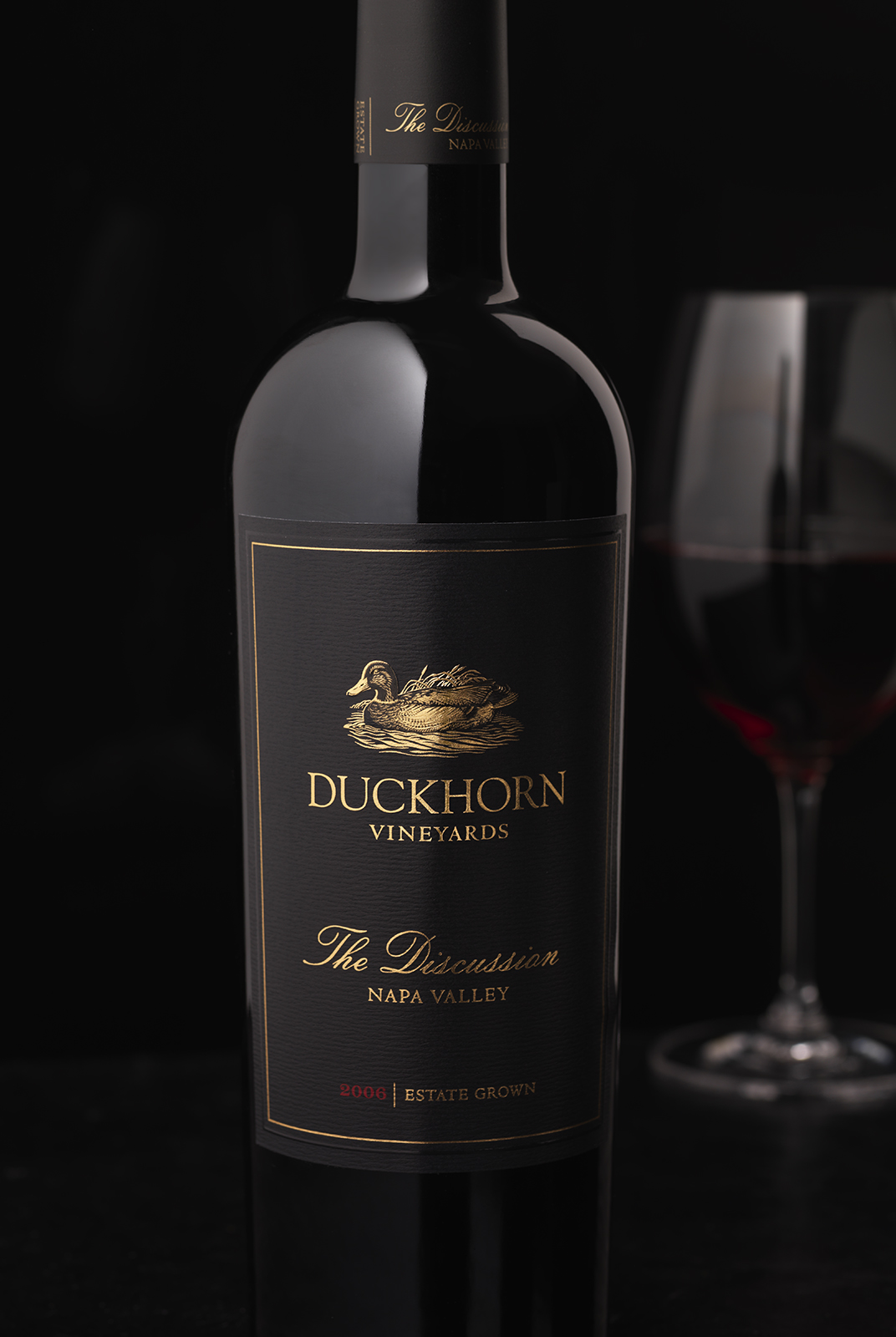
The wordmark was stacked so that it could be increased in size and so that the vineyard designate wines were more clearly differentiated from the core tier.


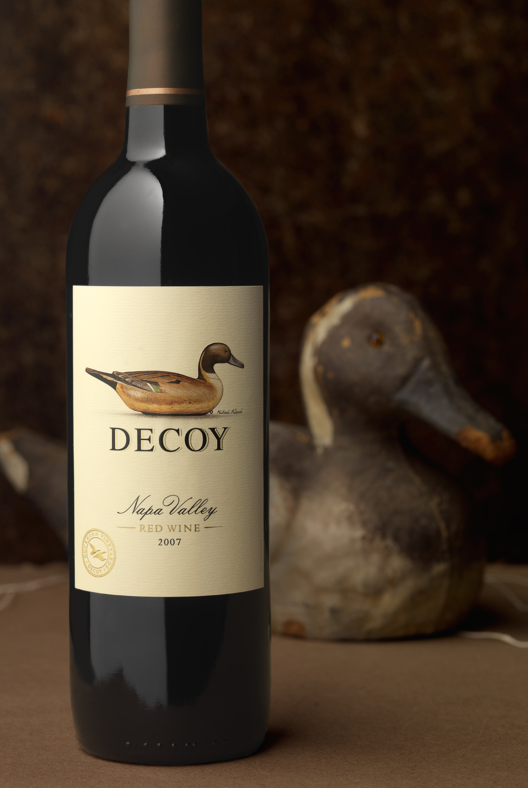
For the entry level Decoy, we leveraged the beautiful painting of the decoy on their existing label.

