Baldacci Family Vineyards

Baldacci Family Vineyards came to CF Napa with the task of redesigning and restructuring their brand’s tiers of wine.
Client
Baldacci Family Vineyards
Country
United States
Project Scope
Logo
Packaging
Awards
2021 Packaging of the World
2021 World Brand Design Society

The refresh was driven by the growth of the winery’s Cabernet Sauvignon portfolio and the construction of their estate’s new wine cave and tasting center. The redesign needed to capture a more premium expression of the brand while leveraging the brand’s multigenerational equities and classic, old world feel. The new packaging also needed to provide a clear differentiation between the various tiers of wines, AVAs and icon wines.


CF Napa redesigned the iconic Baldacci crest to maintain the original elements in a cleaner, more modern expression. The established date was added to the crest to reinforce the winery’s longtime influence in the Napa Valley. A new packaging system was created for the main portfolio and Cabernet tiers to more clearly evoke the AVA and estate grown status. As the wines ladder up in tier, the front label becomes more simplistic and the Baldacci crest takes center stage.


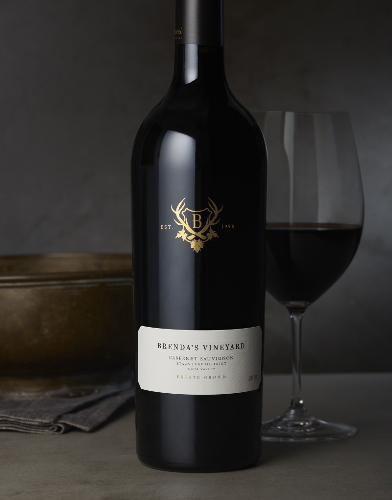
For the highly sought-after Brenda’s Vineyard Cabernet Sauvignon, the Baldacci crest was screenprinted in gold. A strip label with debossed detailing draws the eye to the name of this luxurious wine.


For their icon Fraternity and Black Label wines, the labels were designed with debossed details to create an extra textural dimension.


