Angeline Vineyards
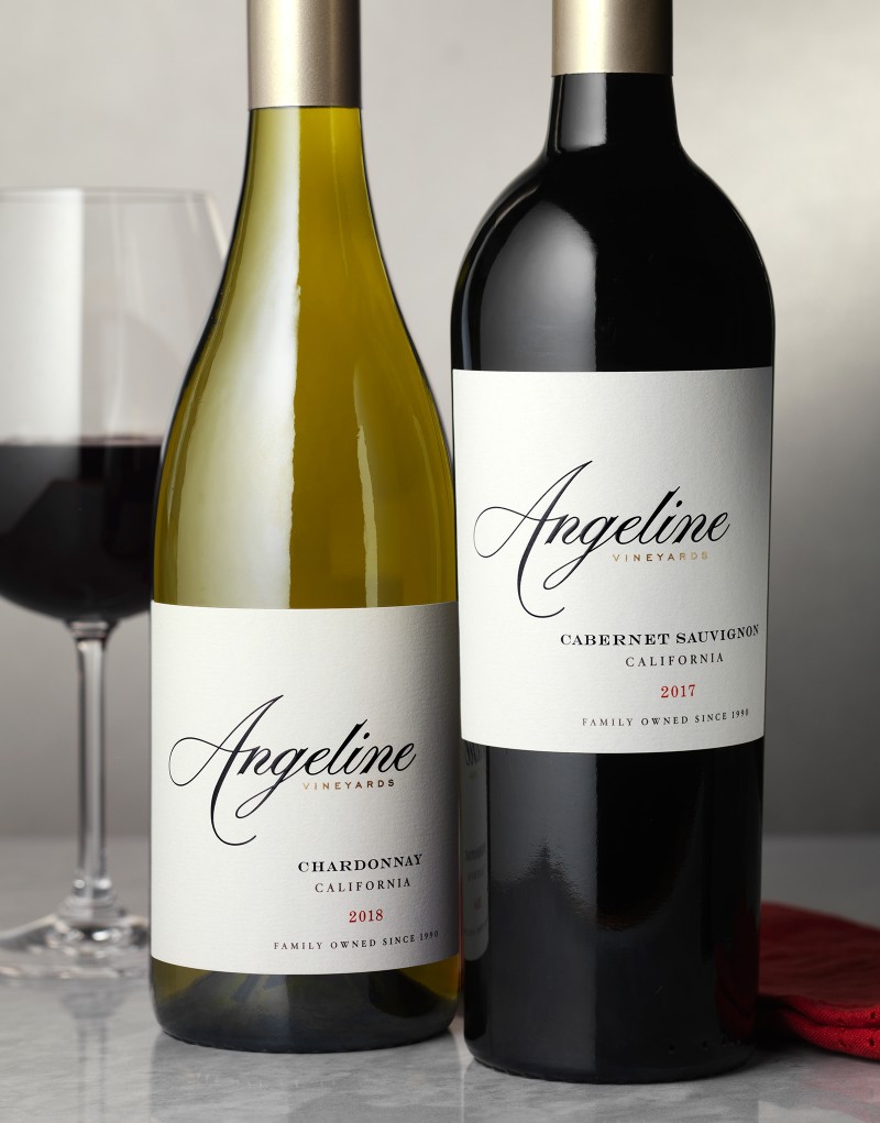
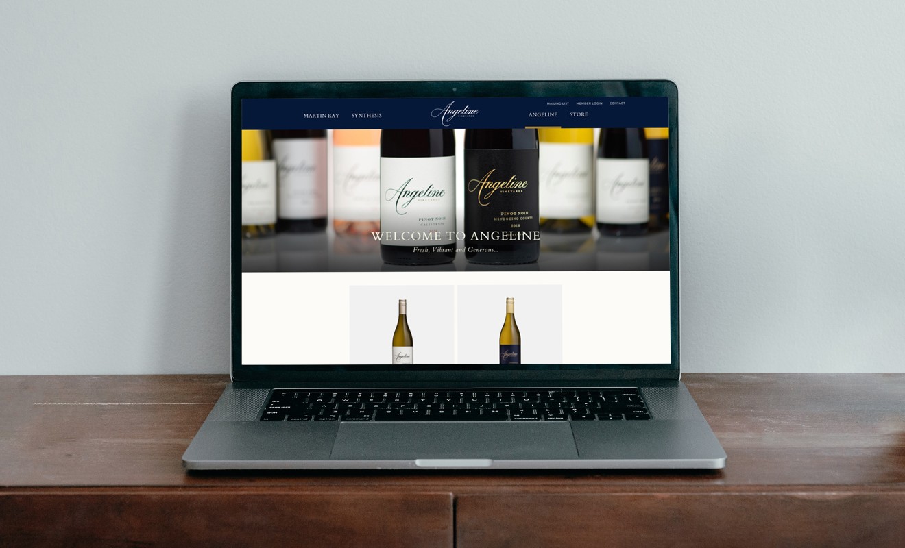
Martin Ray Vineyards & Winery came to CF Napa to refresh Angeline Vineyards to communicate the brand’s fun, easy going vibe while also expressing the exceptional quality of the wines.
Client
Angeline Vineyards
Country
United States
Project Scope
Logo
Packaging
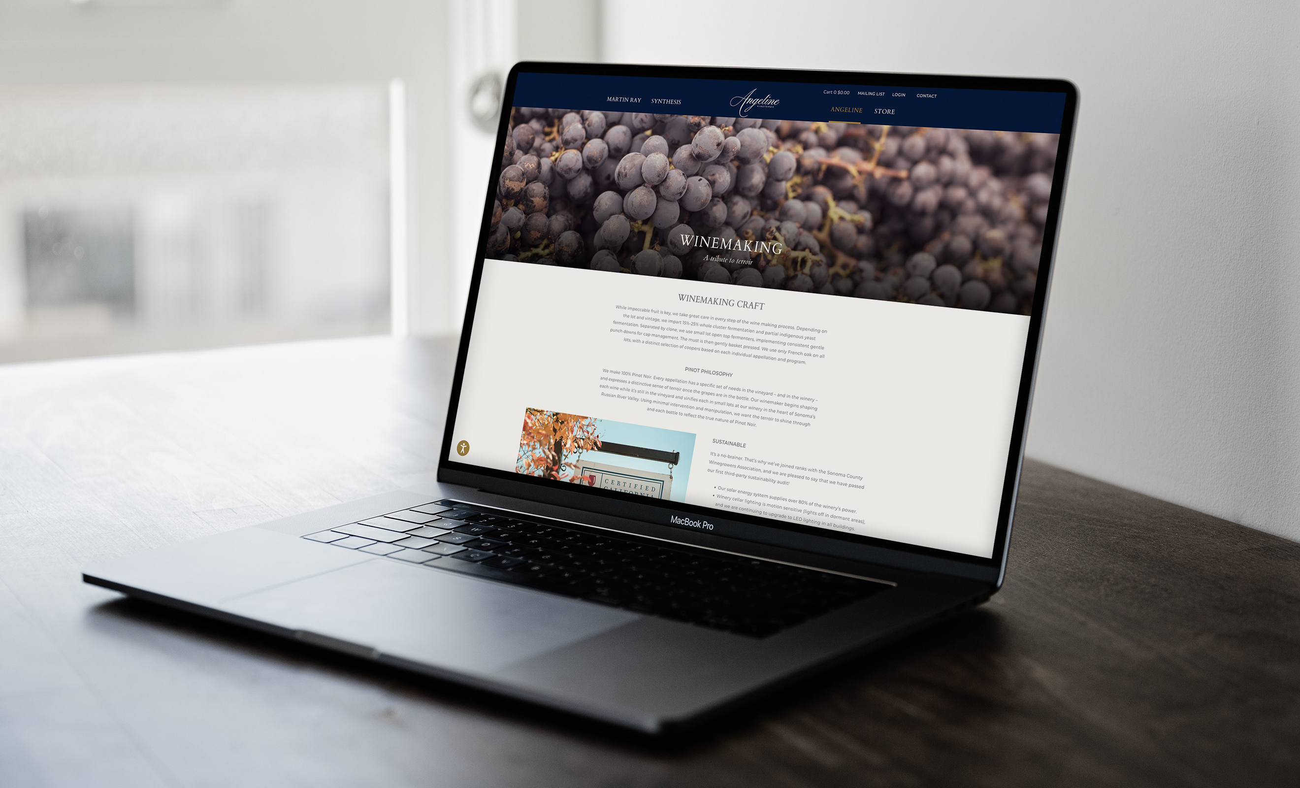
Digital


The design needed to maintain consistency across multiple tiers of wine, but still allow for easy differentiation.
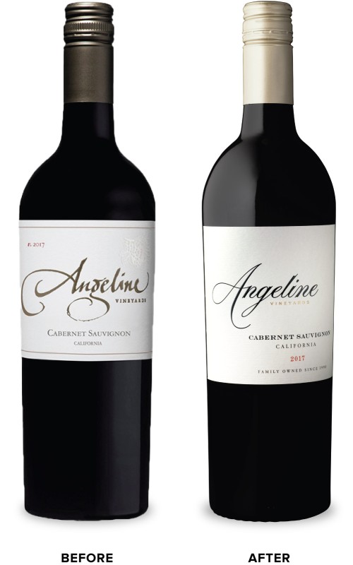
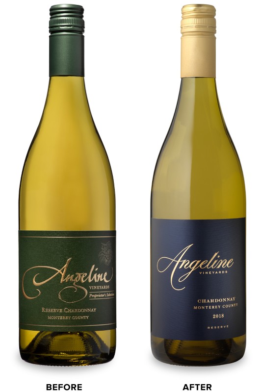
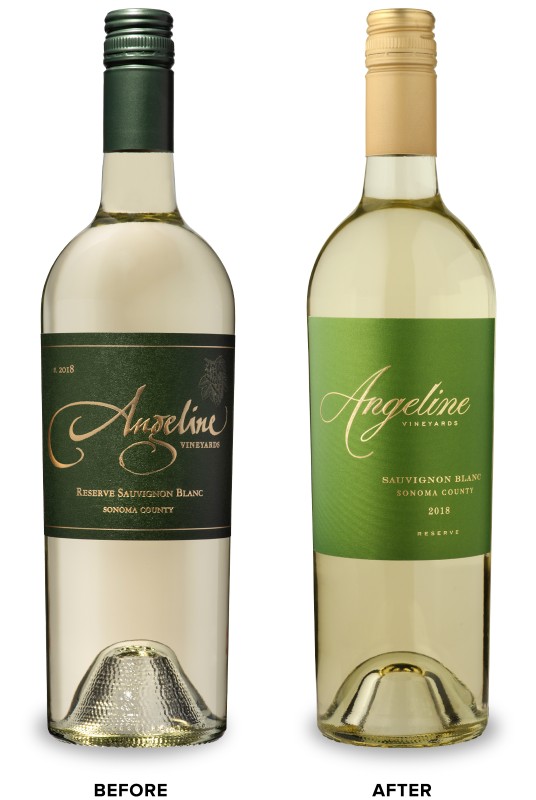
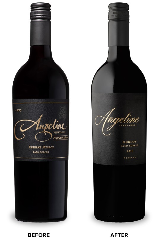
The Angeline Vineyards wordmark that serves as the main label graphic was completely reimagined. The clean, precise script of the updated wordmark flows over the label, alluding to the brand’s attention to detail and quality. Color was utilized to create a delineation between tiers. The main tier of the brand has a classic cream label while the Reserve white wines boast saturated, jewel-toned hues of blue and green. The Reserve red wines, the most premium, make a bold statement with their light-catching silver and jet black labels.


