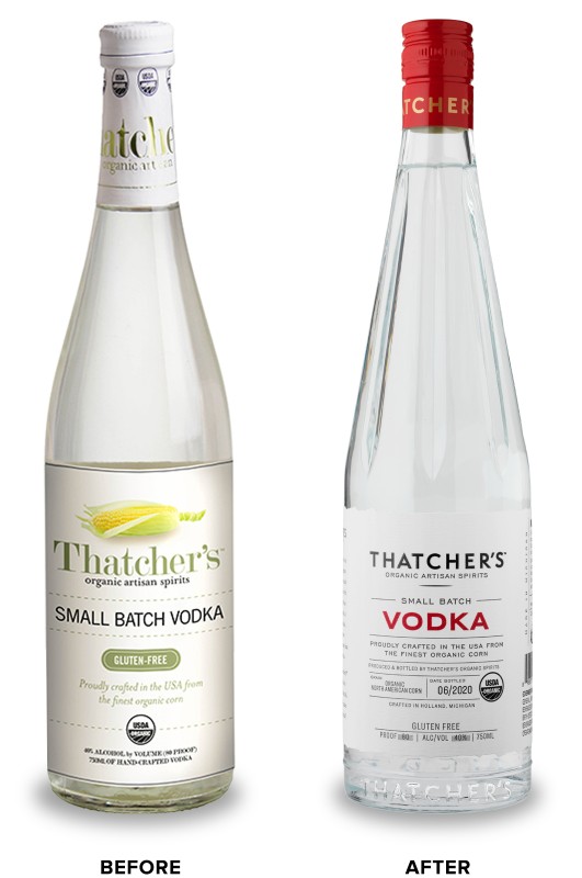
Thatcher’s Organic

Thatcher’s Organic came to CF Napa to refresh their line of organic flavored liqueurs and vodka.
Client
Thatcher’s Organic
Country
United States
Project Scope
Logo
Packaging
In-House Illustration
Custom Bottles
Marketing
Awards
2021 GDUSA American Graphic Design Awards
2021 Packaging of the World
2021 World Brand Design Society
2022 San Francisco World Spirits Competition - Silver

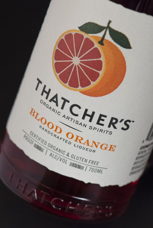
The goal was to restage the brand to be more premium without losing its approachableness. The new design would need to reinforce the brand’s farm-to-table sensibility and organic quality.
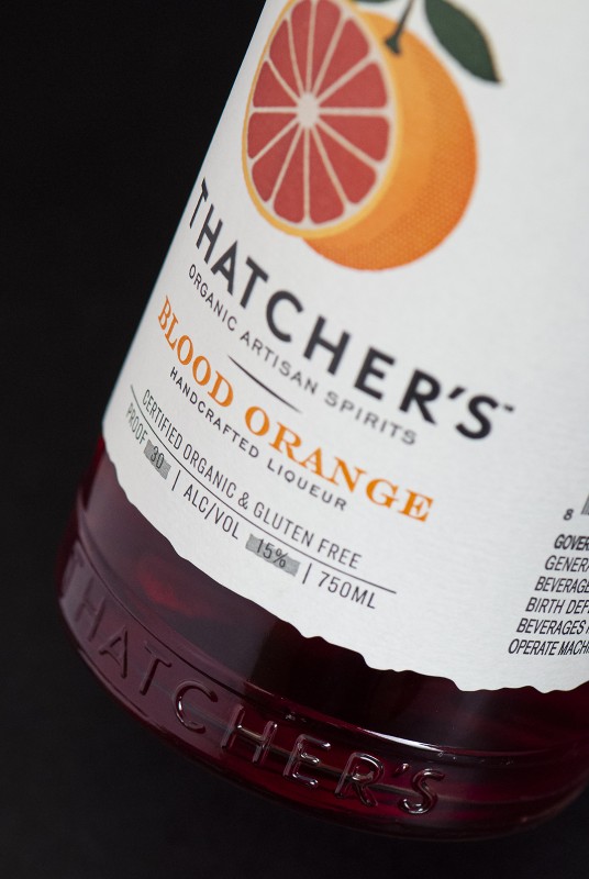
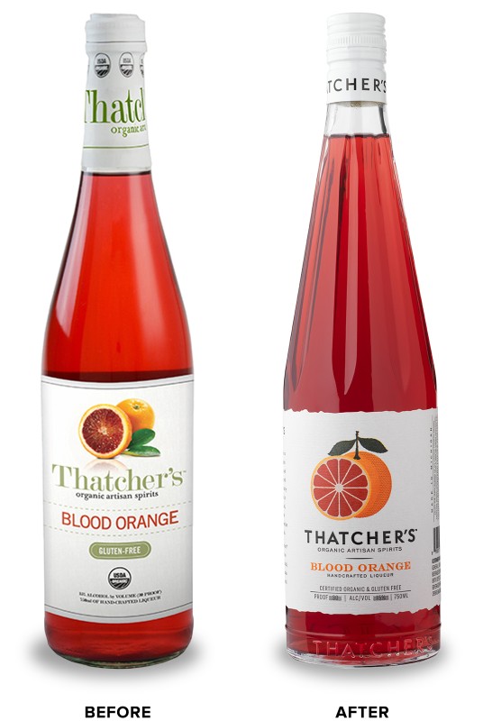
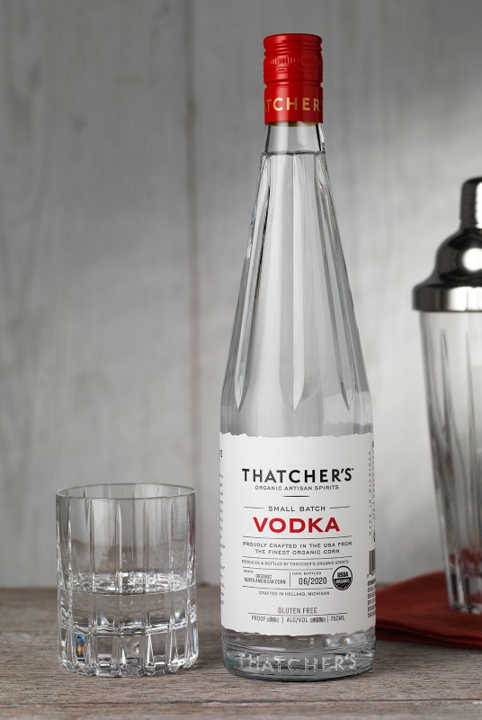
CF Napa’s custom bottle design for the brand was inspired by the beautiful, yet utilitarian French lemonade bottles that evoke a farmer’s market sensibility. The bottle’s neck was designed to capture the shape of vintage citrus juicers. For the liqueur labels, CF Napa drew custom illustrations representing each of the refreshing flavors. The vodka label was distilled down to a very clean, information-driven design to emphasize the purity of the vodka.
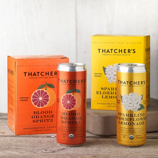
The custom illustrations CF Napa had created for the liqueurs were utilized as the main graphic on the corresponding canned cocktails – creating a familial look and a preview of the refreshing flavors. The bright color palette reinforced the flavor cues and allowed the brand to pop on shelf.
