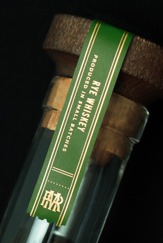
Monson Ranch Distillers

Family-owned Monson Ranch Distillers came to CF Napa to develop the packaging for their namesake line of whiskies and a logo that was flexible enough to use across the branding of their whiskey and custom distilling company.
Client
Monson Ranch Distillers
Country
United States
Project Scope
Logo
Packaging
Awards
2025 Communication Arts
2025 LogoLounge Book 15 - Winner
2025 Packaging of the World
2025 World Brand Design Society
2025 Graphis Packaging 11- Gold
2026 Graphis Design Awards - Gold

Monson Ranch is a true ranch, utilizing home grown rye and corn for the spirits they produce, and the design needed to reflect this farm-to-bottle experience.
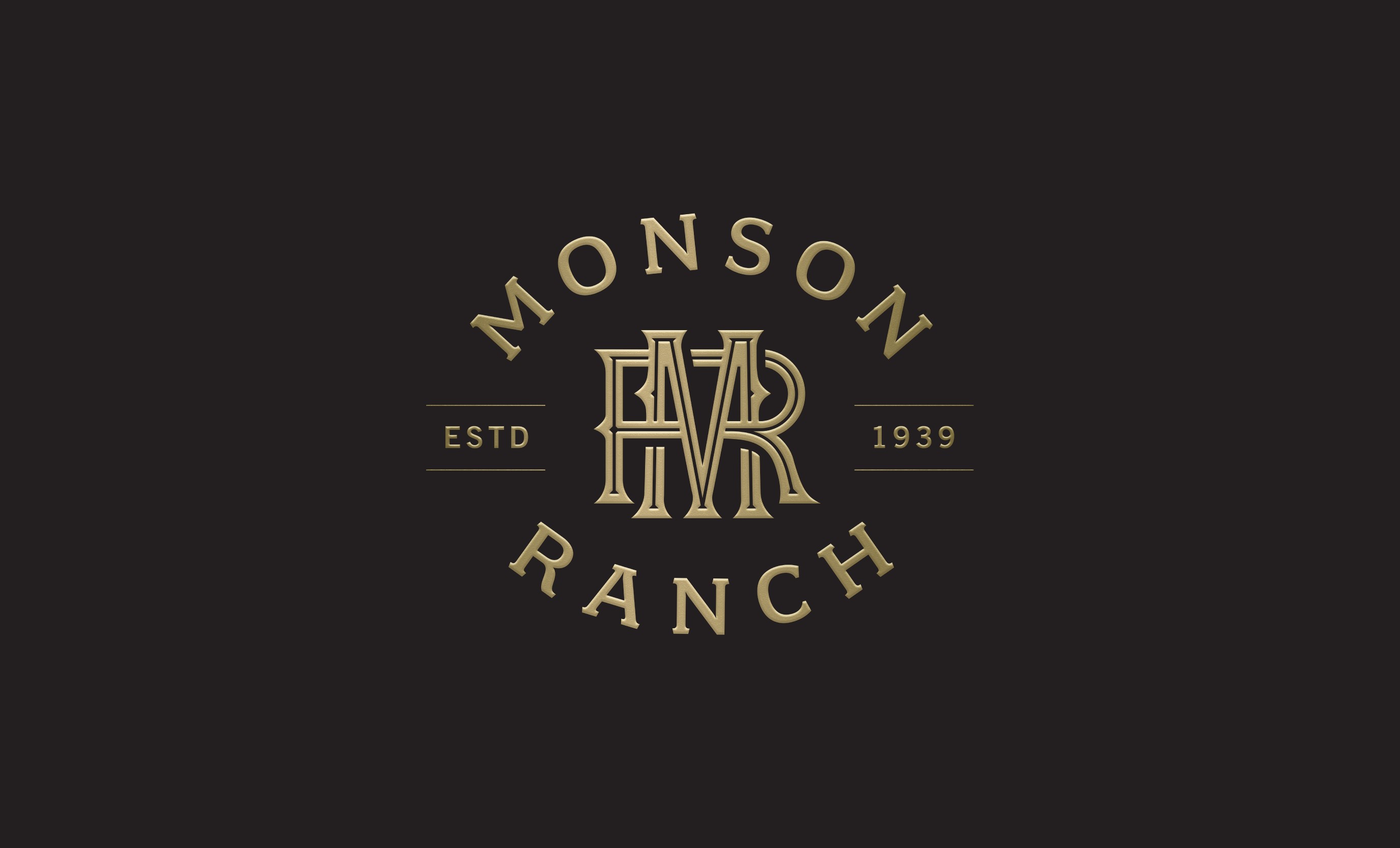
For the logo, CF Napa developed a circular monogram and wordmark lock up inspired by their family’s cattle brands. The inclusion of the founding year establishes the Monson family’s multi-generational commitment to the Washington farming community.
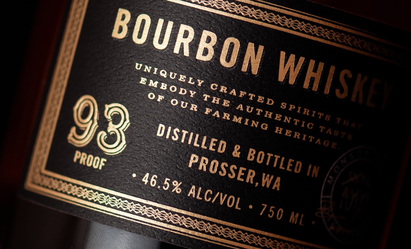
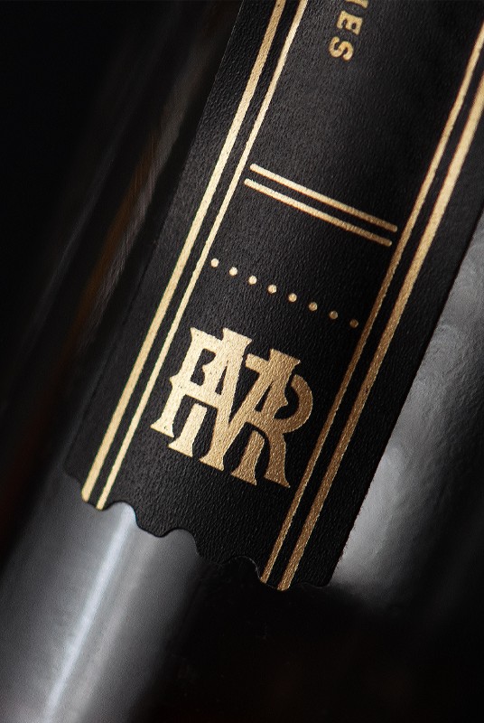
For the Reserve packaging, the logo was screenprinted on the bottles. Impactful black labels with gold foil details were utilized for the tax band strips and to display the type of whiskey.
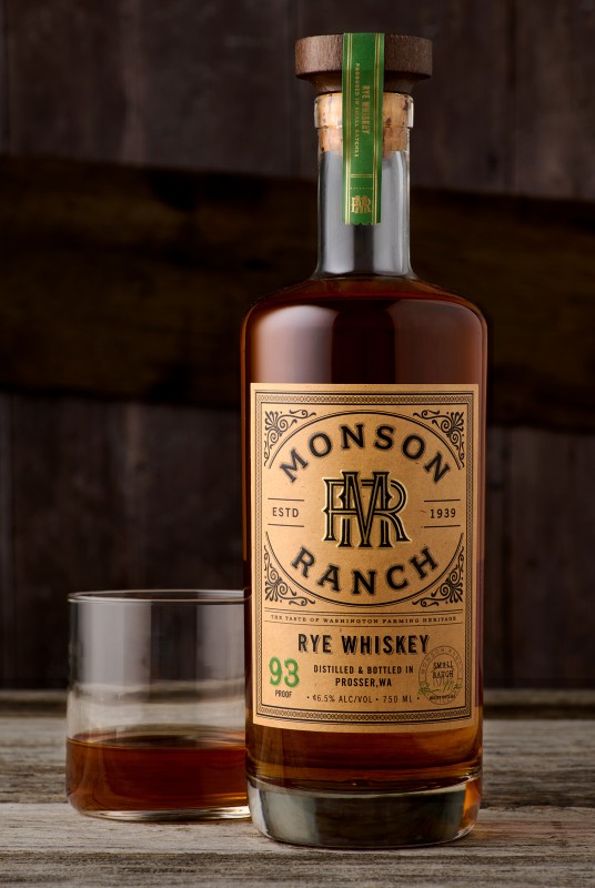

For the core tier packaging, the logo was framed by wrought iron-inspired filigree and placed on a tan label for a rugged country vibe. The warm, leatherlike color palette was contrasted by the vibrant colors used for the proof and tax band strip to differentiate between products. The same bottles and closures were used across tiers to allow for production efficiencies and to maintain a cohesive look for the family of spirits.
