Sonoma Distilling Co.

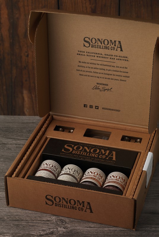
Sonoma Distilling Co. came to CF Napa to revamp the packaging for their line of whiskeys. The goal was to position the brand for growth with a flexible packaging system and strong, consistent brand messaging.
Client
Corning & Company
Country
United States
Project Scope
Logo
Packaging
Custom Bottles
Marketing
Awards
2022 Packaging of the World
2022 The Spirits Business - The Design & Packaging Masters - Gold
2022 World Brand Design Society
2023 World Whiskies Awards - Best Relaunch/Redesign, Gold
2024 Graphis Design Annual - Silver


Special attention needed to be given to their unique hyper-local focus, while establishing a clear system allowing for product expansion from their core tier into their specialty, single barrel and cream liqueur tiers.
CF Napa designed a custom glass bottle with cartouches of the Sonoma Distilling Co. logo, asserting the brand’s quality promise. The previous packaging placed an emphasis on the product name by locking it within the logo – creating confusion over the brand name and complications as the brand expanded into multiple tiers of products.


To solve this, CF Napa pulled the product name out of the logo lock-up and utilized one logo across all SKUs. A double-label system was developed with the main label prominently displaying the logo and messaging supporting their status as a Sonoma County, locally produced brand. The secondary strip label organized the product name and SKU-specific information. A color-coding system was developed to aid in product recognition – across tiers all Bourbons utilize a maroon color, all Rye products use a green hue, and specialty items have their own color designations. For the exceptional Cherrywood Smoked Whiskeys, the wordmark received a gold foil treatment, setting these special spirits apart. For the specialty Black Truffle Rye, the gold lettering was placed against a dark black label – positioning the offering to stand out from the rest of the portfolio as an exceptional whiskey.


