Brand Repositioning Case Study
Duckhorn Vineyards
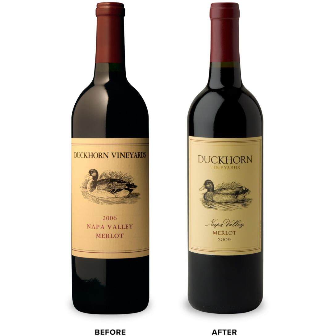
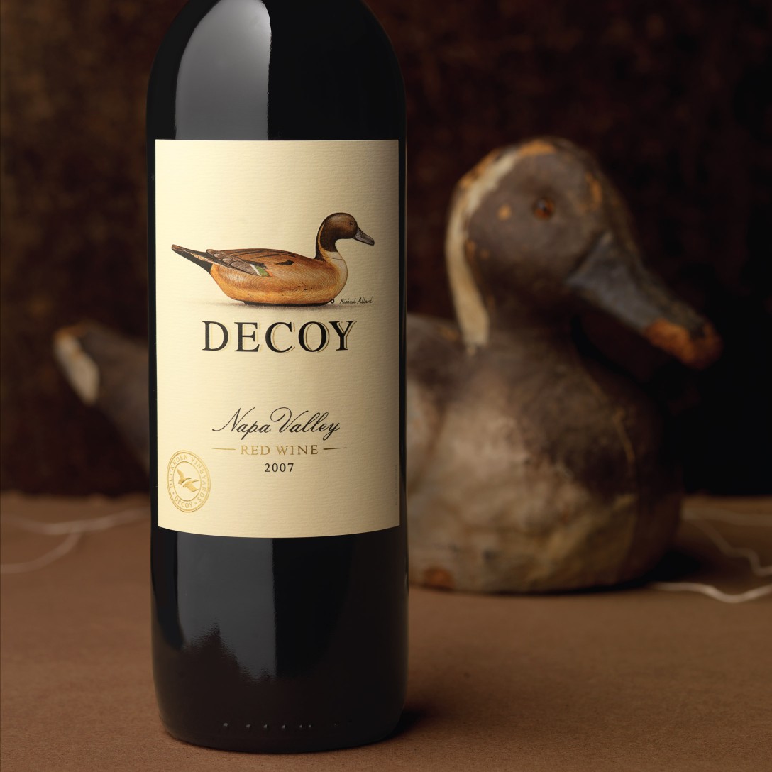
New Packaging Helps Duckhorn Vineyards Build Its Flock.
Marketplace Results
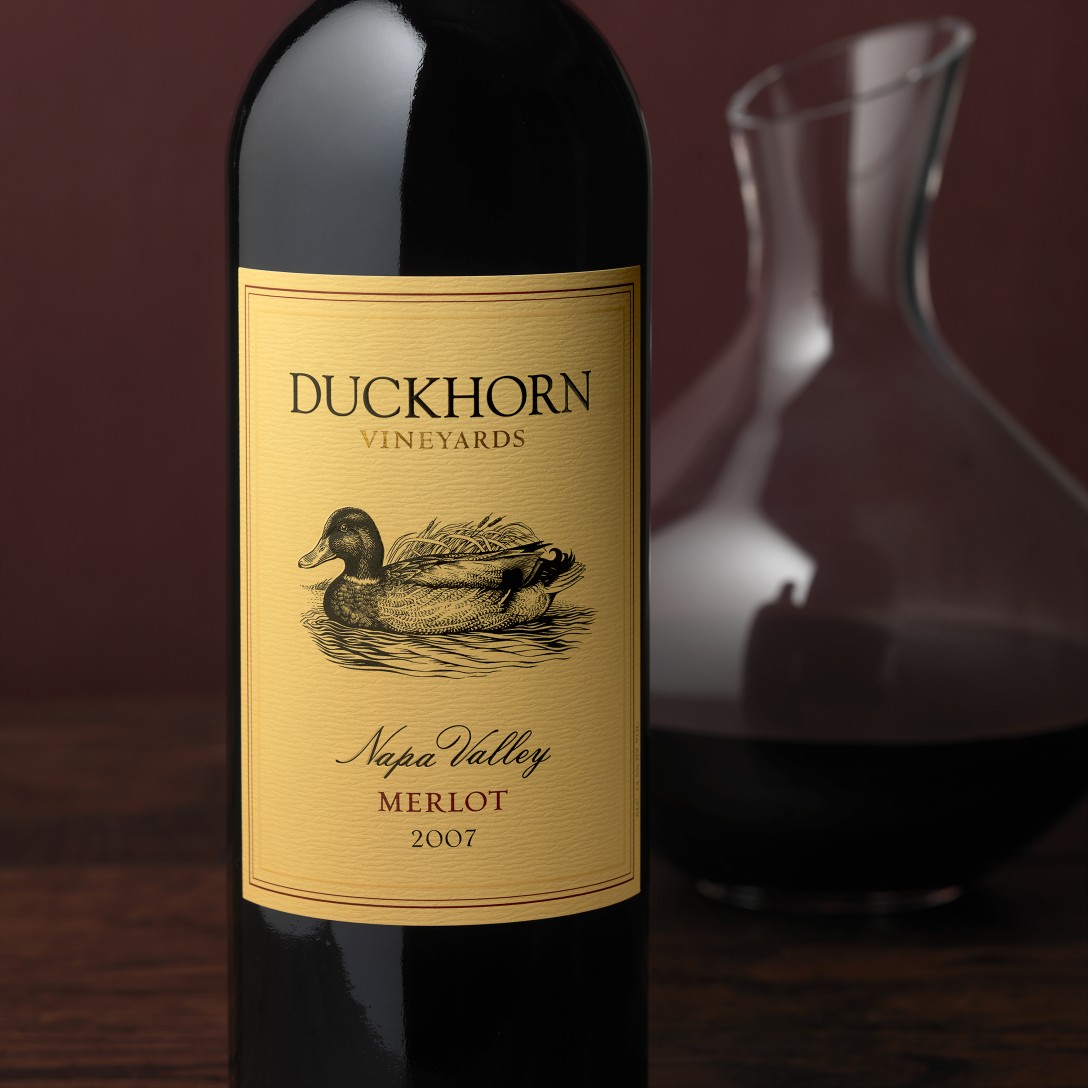
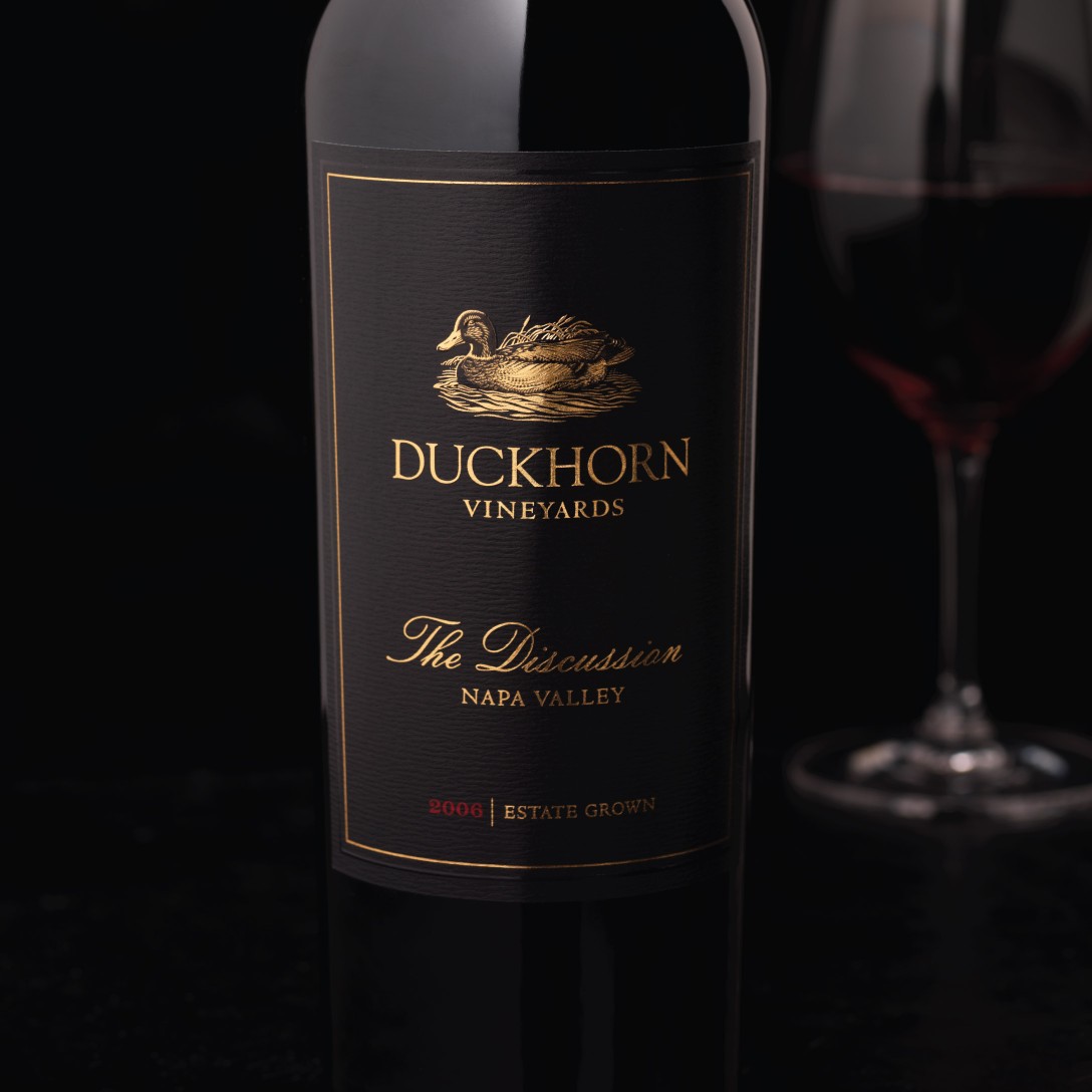
Immediately after its launch, the revitalized Duckhorn packaging was met with enthusiasm from distributors and key accounts. The new contemporary look allowed the winery to raise pricing for all the tiers by $10, increase production and expand distribution. Growth has been substantial and has lead to production quadrupling since the launch of the new packaging. The Discussion has maintained its sought-after positioning and has repeatedly sold out upon release.
“CF Napa delivers creative and intelligent design that gives consumers an emotional connection with the product. They have been engaging and responsive partners, always collaborative and fully understanding of our brand essence and objectives. They consistently bring new and fresh ideas to the table.”
Steve Myers
Vice President, Marketing
Duckhorn Vineyards
Client
Duckhorn Vineyards
Country
United States
Project Scope
Logos
Packaging
Marketing

